


The importance of having a mobile UX design strategy from the start
In 2023 the role of mobile apps for businesses is higher than ever. There are over 6.5 billion smartphone users across the globe according to Statista, and according to eMarketer, 88% of adults in the United States of America spend their mobile time on apps. Quality matters, as TopTal claims that 90% of users stop using an app due to poor performance.
So, how do you come up with a mobile application design and development strategy that will ensure your app’s success among competitors and keep your users happy while using it? We will talk about it in this article!
First, we need to define what mobile user experience (UX) is. UX is the positive and/or negative emotions of a user during their interaction with a product, application system or service.
Mobile app design and development strategy is a thought-out plan for creating an app that will be pleasant to interact with and provide a holistic experience throughout all possible interactions and scenarios. This strategy includes user interaction, content, and intuitive design, with an entire customer journey in mind.
“UI is the saddle, the stirrups, & the reins. UX is the feeling you get being able to ride the horse.”
— Dain Miller, Web Developer
User experience (UX) and user interface (UI) can be sometimes confused as they interact closely, but they are not the same thing. Yes, UI is part of UX, but it is not limited to it. A well-designed UX covers both the UI and the user experience before, during, and after interacting with an actual app. If done right, mobile app UX can increase your sales, strengthen the brand image, and keep customer satisfaction and loyalty high.
How mobile application design strategy differs from desktop apps?
There are quite a few differences that you should be aware of if you want to create iOS and Android specific designs, because the same-as-desktop approach won’t work. Let’s take a closer look:
Screen size
Desktop computers have huge screens, compared to mobile, so you will have a lot of space for the placement of information and freedom for different design solutions. With 4-5 ½ inch mobile screens, for example, space will be limited and will require a different design approach in order to optimize the content.
Prioritization is a key for mobile design and development strategy here, as you will have to make decisions on what are the most important pieces of information that should be visible first and what content should be collapsed or hidden altogether.
Screen orientation
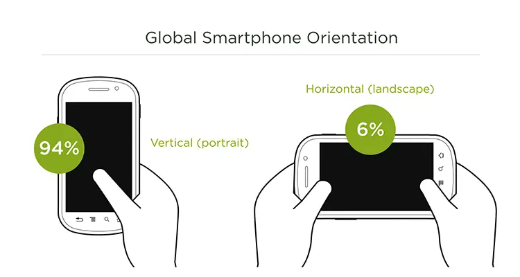
With a desktop screen, it is simpler because people only view them horizontally. With mobile, however, users can view them both horizontally and vertically. As you plan your mobile app user experience, you need to keep in mind that 94% use the smartphone vertically (portrait orientation) and 6% horizontally (landscape orientation). Some users will flip between, so proper appearance on either orientation is a must:
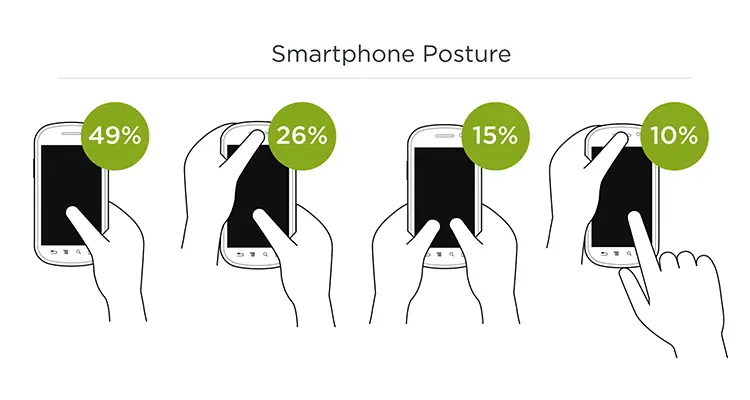
Consider that most users prefer to use smartphones only with their thumb, so there will be a limited number of points that will be available to reach comfortably. So, while there are other options, the one-thumb approach is a great place to start.
Input and navigation
Some desktop devices allow touchscreen, but most of them still rely on a mouse and keyboard. Mobile users are limited to touchscreens. What is really important here, is that your app will offer users suitable virtual keyboards in certain situations. For example, when there is a necessity to input a phone number, the keyboard must be numeric by default. When non-numeric typing is needed, the keyboard should be set to normal. If you don’t think of these simple things, it will damage the overall UX of your app, forcing users to switch keyboards manually.
Function and environment
Desktop apps are usually aimed at important or critical tasks like work planning or banking, so the chances are the user will be running them in a building or secure environment. Mobile applications, on the other hand, can be used for seemingly anything from renting an electric scooter to calculating the calories burnt during the morning run. More often than not, users will prefer mobile apps to solve a variety of tasks while on the move. That’s why it is important for mobile applications to be even more simple-to-use and accessible during any time of the day and under any type of weather condition.
Split screen
Large desktop screens allow the opening of multiple apps and websites simultaneously. You can easily open a Google spreadsheet, calculator, and music player on the same screen. While the new models of smartphones support split screens, it’s not nearly as common compared to desktops. So, it is important to offer users everything they’ll need in your app, if possible. Avoid any reason for users to open other apps for similar tasks, because they could get distracted and move on after switching.
Iconography
Both mobile and desktop applications have the usage of iconography in common. Make sure that your app uses common and consistent icons between the two environments, so there isn’t any confusion.
Seamless design
If you plan to build both desktop and mobile versions of your application, consider seamless design as a part of your strategy. The essence of this is that both versions should look and feel similar, and be recognizable independently of each other. Yes, you can’t have the same look and amount of features on both, however, you can offer similar designs and user experiences that make the end user feel as though they are using the same product.
Mobile application design process: Key stages
To help you obtain a better understanding of Android and iOS mobile app design and development strategy, let’s review briefly the essential steps of the mobile app design process.
Planning
At this stage, everything should be planned carefully and involve business, design and development, to avoid roadblocks in the future. During the planning stage, the time and budget estimates are set, as well as the amount and types of features.
Research
This is when the design team performs the necessary research to learn more about the users, needs, and goals for the project. How will users use the app? What basic functions need to be included? Are there any unmet needs? With both, mobile and desktop design strategy, it is important to conduct basic UX research to answer fundamental questions from the start to make sure you have a firm foundation for your application.
Specification
After the research is done, designers come up with a specification that should be approved by the customer. This document includes the tech stack and tools that designers will use in the project. The developers will receive the specification document after all design activities are complete.
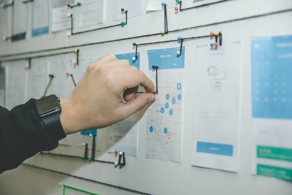
Wireframing
Wireframes are considered lo-fidelity designs of the application you are going to build, with all important features of the final product represented. If the designs for iOS and Android will be different, it makes sense to create separate wireframes. Even if the core design is the same, the app navigation may differ slightly. This process takes a little more time, but it is important for your team to dedicate enough time to the discussion of all these details.
Prototyping
The next step is the creation of a clickable prototype using the wireframes you’ve created. There are many prototyping tools out there, but even Powerpoint or Keynote can be used for this. Stitching the screens together will allow you to mimic the interaction of the user and the product to collect feedback and make changes.
Testing
Usability testing goes hand-in-hand with prototyping. Putting your prototype in front of actual users and having them perform basic tasks will provide you with valuable insights on your design and product. Testing with at least five users will provide you with enough data for iteration. Re-test your designs and iterate until all the major kinks are removed.
Starting the development process
When the design is finalized, it’s time to hand over the project to the developers that will build the actual application. Even with the most thought-out iOS and Android mobile app design and development strategy, there still could be some challenges and bottlenecks during the development process. Make sure to hire the most proficient software developers you can, and don’t forget about QA Manual and QA Automation experts to get the highest possible quality of the final product.
Important things to consider in your mobile design strategy
Navigation
We already discussed website navigation design in great detail, and the importance of navigation for mobile apps is just as important. Always strive for simple and intuitive navigation, that requires as less effort from the user as possible. To achieve this in your design, it makes sense to put a minimal amount of navigational elements, and don’t overload your interface with unnecessary options.
Type
Keep in mind, that the text is probably one of the most important elements of your app. When the user downloads and starts the app, the text is one of the first things that gets viewed. Make the right font choices to achieve maximum readability. Additionally, use appropriate spacing between words and lines, suitable to read on different mobile displays. You can always allow users to change fonts in the settings menu, but your default option should work great.
Color
If you are an established organization, the color scheme is likely to represent your brand, at least it should. However, if your app has the freedom to deviate from your brand or you are starting from an open palette, just make sure to create a palette that resonates with your audience and is fully accessible.
iOS and Android: What are the differences in mobile app design strategy?
While the steps for design and development for both popular platforms are the same, the difference lies in their style and designs.
Material design
Google introduced Material Design, which is a style that all of its software must adhere to (here is the latest Material Design 2.0). Android developers should follow specific guidelines for Material Design during the software development process. The usage of this style improves the look of the apps and has a convenient editor for sketches of UI/UX designs.
iOS Human Interface
Apple’s Human Interface Guidelines (HIG) is a similar concept for iOS devices. HIG includes specific resolutions for each model of
iPhone and iPad and relevant types of icons, fonts, color schemes, navigation bars, etc.
UX design for mobile app: Best practices to follow
Minimize unnecessary content
Make sure that your app contains only necessary content. Any feature will add to loading time and make your app more difficult to use. Extra elements may impact the experience negatively and potentially create a mess visually. As we mentioned, most users prefer vertical smartphone orientation, so width is extremely limited.
Focus on what’s really important and create proper hierarchy with a minimum amount of images that are placed close to each other.
Work on navigation
Along with visual elements, navigation should also be intuitive. Users should always be able to navigate your app without any frustrations. There are a lot of elements to this aspect, that definitely deserve an article on its own. However, the basic rule is to include a few primary actions on each screen and use progressive disclosure, which means splitting big chunks of information across multiple screens.
Once again, the more popular vertical navigation should be carefully considered here, as all clickable parts of your app must be reachable with a thumb. As for sizes, keep your font size at least 16 pixels and buttons at 42 pixels so that everything will be legible and accessible for users.
Keep user interaction minimal
Just like with any content nowadays, you need to make sure that users waste as little energy on your app as possible. Minimize the amount of information that users have to type in. There are a lot of methods that can minimize user effort, including:
- Integrate social media account login feature and let the users log in using Google or Facebook
- Allow users to stay permanently signed in, if the type of app and security standards allow
- Save result searches and let users browse their search history
- Consider implementing voice recognition feature to minimize the necessity for typing
Some mobile UX design examples
To wrap up, let’s review some of the examples of the great mobile UX design strategies implemented on real products. Maybe they will inspire you to partner up with an experienced mobile software design and developer for your next project!
Uber
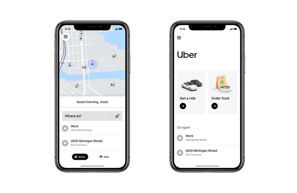
A world-renowned ride-sharing service has a simplistic design where nothing distracts from the main tasks of the app to request a car ride or order some food via Uber Eats (a food delivery service). As you can see, easy-to-read typography is used here with a simple color scheme. The app also remembers previous destinations to minimize user effort the next time around.
YouTube
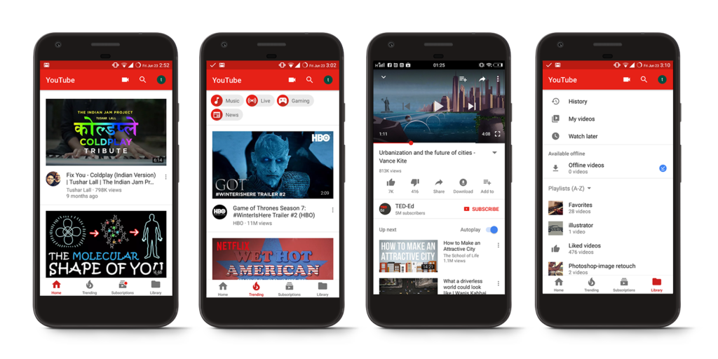
Probably one of the biggest features of YouTube is their personalized AI-powered system that offers users content based on their previously watched content. Their mobile app offers an easily scrollable list of videos right from the start. As for user convenience, the app allows users to stay signed in persistently. Additionally, all icons are recognizable, and it is very simple to find trending videos.
Starbucks
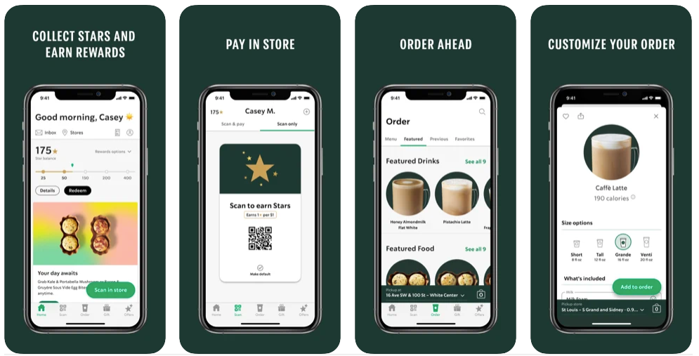
The main goal of this application is to allow users to order coffee on their way to the café. Everything was designed with this idea in mind, with great use of space, clear labeling, and saved history of previous orders to reduce instances when users need to type in.
FAQ
What is a mobile app design and development strategy?
This is a detailed plan for creating a mobile application and how the users will interact with this. You need to have a strategy to build an effective product with the best user experience possible.
What are the three most important elements in your mobile design strategy?
There are a lot of elements to consider, but it is a good idea to start by focusing on your Users, Business Goals, and Technology.
What are the stages of the mobile application design process?
The key stages include:
| Planning | Deciding on features and setting time and budget estimates |
| Research | Determine actionable insights that will lead to a more robust application |
| Specification | Creating a document with defined product specifications to design and build from |
| Wireframing | Designing lo-fidelity mockups of your app experience |
| Prototyping | Simulating the user interaction and workflow with a clickable prototype |
| Testing | Performing usability testing with actual users to validate the design and product |
| Development | When developers build the product according to specifications |