In 2022, UI/UX design is more important for businesses than ever. According to a study by Forrester, a great UX design can raise a website’s conversion rate up to 400%! Truelist claims that every dollar invested in UX design results in an ROI between $2 and $100. If Toptal is to be believed, 62% of customers will be less likely to purchase from the brand if they have had a negative experience with a mobile app.
So, what do you need to do in order to build a great UI/UX design for your website or app, or to improve the existing one? There are a variety of elements to it, and one of the most important things is user flow design.
What is the user flow?
In web or app design, user flow is the path made by a user to complete a task. The user flow is a journey from an entry point through multiple steps to the outcome, such as purchasing a product or service.
There are different types of flows that capture different levels of information.
- Customer journey map
- Task flow diagram
- User flow diagram
- Wireflow diagram
Each type is very different and serves different purposes. A customer journey map is a diagram, or a number of diagrams, that illustrates stages that the customer goes through while interacting with a company:
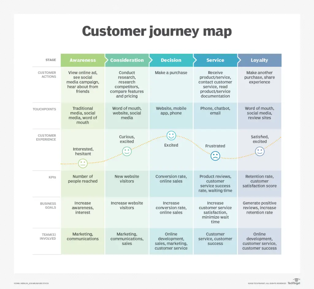
A task flow focuses on the user’s journey through a specific task. Here is an example of a task flow:

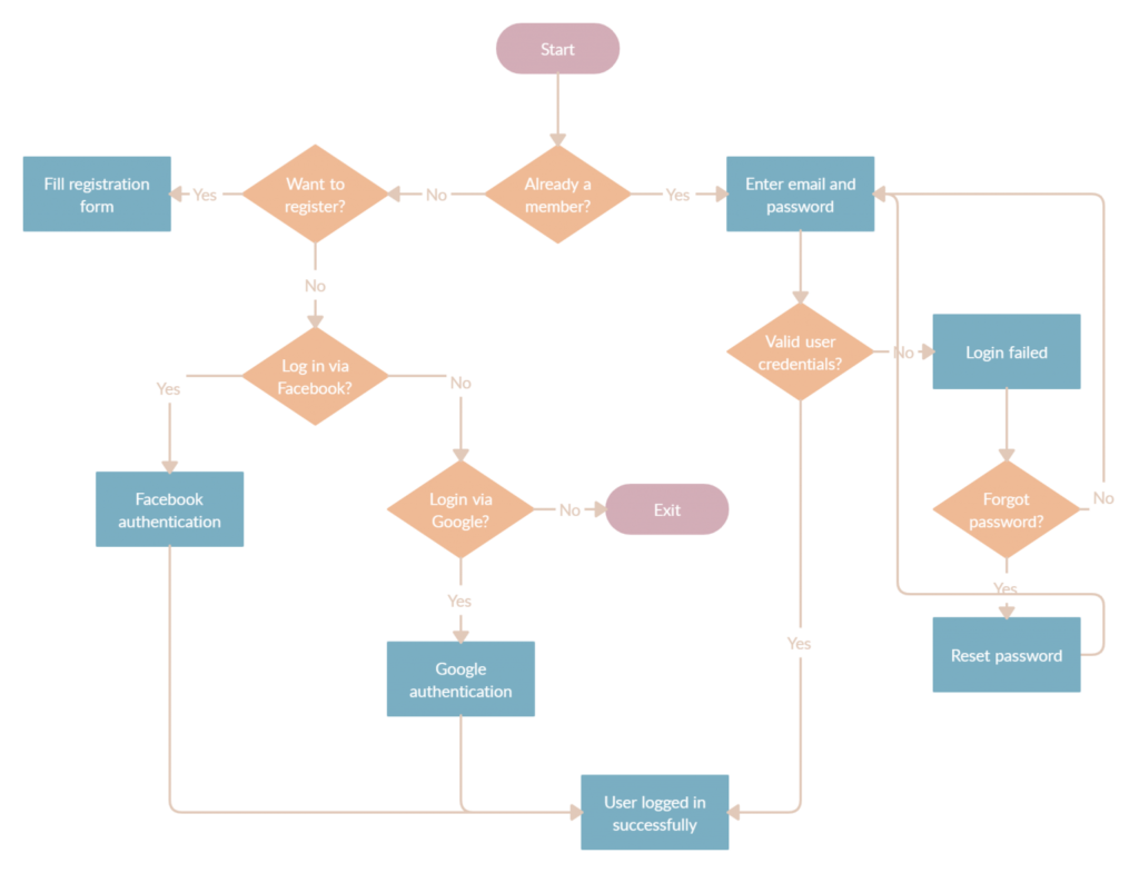
User flows, on the other hand, are more complex. It is emphasized that not all users will have the same path on their journey. Additionally, user flows are attached to specific personas and entry points. So, in this type of user experience flowchart, there are multiple scenarios and the journey starts at different places, but the main task still remains the same. User flows can be considered a part of a customer journey that happens during the visit of a website or an application. Here is an example:
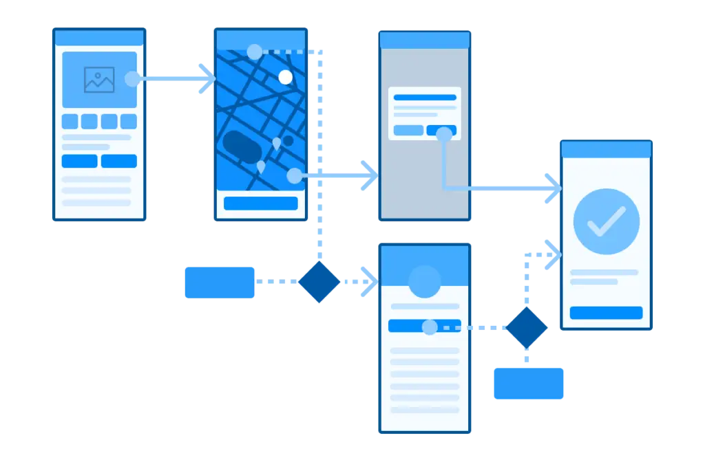
Finally, wireflows can be perceived as a combination of wireframes and flowcharts. Wireflows are great for mobile development because the small size of screens can be used to replace abstract shapes. Wireframes are low-fidelity designs of a design experience. They are often an outline of content that will reside on a page or screen to give users an indication of what might be displayed. These include placement for images, text, buttons, or other combinations of these. Here is an example:
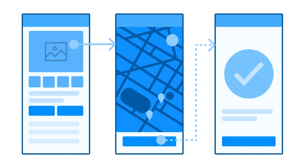
Today, we will focus on creating a user flow diagram, and explain why it is important to always use them in order to design an outstanding user experience.
“Everything is designed. Few things are designed well.”
— Brian Reed
Why do we need to design a user flow diagram?
User flow diagrams are created mostly for UX and product teams to model customer flow on a particular application or website. When you design user flows, it will provide you with the following advantages:
- It will help you to make adjustments to your user interactions after determining the areas that can be improved upon
- You will be sure that you added every important step in your flows for the user’s experience
- You will be able to make changes before investing a significant amount of time and money into the design
- You will be able to present ideas to stakeholders and investors to get feedback and understand their expectations and ensure alignment
Investing in a user flow diagram in the design phase will pay off eventually by cutting down on headaches in the future and preventing changes to the project when they will become really expensive to execute.
User flow diagram creation process
Don’t rely on guesswork while creating user flows in UX design. First, you need to obtain the necessary information to make the right decisions and get the best results.
Determining the objectives
Start with determining the destination; how can you give directions without knowing where you’re going? You need to have a clear understanding of what customers want from your website or an application and where you want them to end up while using it.
Chances are, you already have the overall goals solidified, like purchasing the product, signing up for a newsletter, or buying a subscription to your services. If you don’t, you need to take a step back and create a customer journey map for your company. Having a customer journey map is essential to building an effective UX flowchart.
Understand how users find your website
If you already have a website you want to improve, you need to obtain data on how customers discover your product. Platforms like Google Analytics will provide you with the percentages of traffic and other valuable insights. Common sources include direct traffic, organic search, paid ads, social media, referral sites, and email newsletters.
The sources of traffic will become the entry points for your app or website flow diagrams and will enable you to model multiple scenarios.
Discovering what information your user needs and when they need it
With entry points covered, it is time to think about what information users are looking for and what actions they need to take in order to get it. To turn visitors into customers, you need to figure out how to provide the correct information when they need it.
Always consider the perspective of your customer while creating a user flow diagram and figuring out the flow. Think about questions like:
- What action a user should take on this particular page?
- Can the user navigate to their cart and checkout from any page?
- Is the accompanying page content relevant?
If you tap into the mindset and feelings of your audience, you will be on the right track.
Mapping out your user flow
With the knowledge of your potential customer and their motivations, and the most popular sources of traffic you can create an actual user flow diagram. We will provide you with the details in the following sections.
Collecting feedback and finalizing
After your diagram is complete, it is time to collect feedback and implement any necessary adjustments. The stakeholders will be able to understand the experience that you are proposing quickly and share their thoughts. After you get approval for the final version, you can share a user flow diagram with software development experts and UX designers before they start to build your website or an app.
Creating the user flow diagram in detail
Designing user interface flow diagrams may seem like a complex process at the start, but when we break it down into individual elements, it becomes much simpler. The first thing you should do when creating your UX process diagram is to describe a basic flow, similar to a mind map. Draw boxes that will represent particular actions. The initial outline of your user flow diagram may include just three basic stages: an entry point, steps of the user journey, and the desired final interaction (end goal).
Entry point
As described previously, for a website there are multiple entry points, from direct traffic to links in the email newsletters. Applications, however, typically, have only one entry point, which is the Google Play or Apple App Store. In some cases, applications can also be downloaded by direct links, articles, or advertisements. This is how the entry point may look on your diagram:
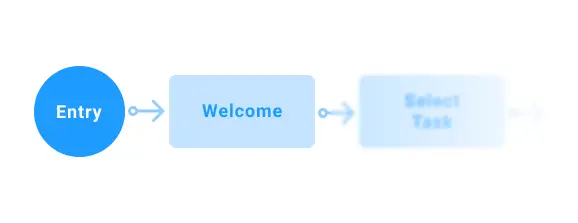
Steps of the user journey
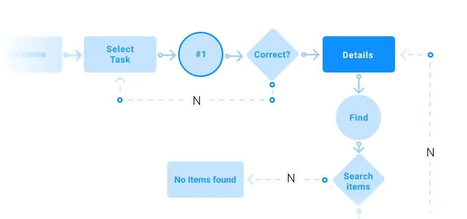
This is the essence of your entire diagram. Here, you should draw the main pages (for a website) and screens (for an app) that the user will go through. Examples may include sign up, home, onboarding, item selection, or any other necessary screen or page to get your user to the end goal. In the first drafts of your user flow diagram, it is fine to add high-level descriptions without going into the details, because you can add that later. The initial chart needs to show the journey of your user through their key steps and illustrate the clear path to the end goal. Here is how this stage might look:
Final interaction (end goal)
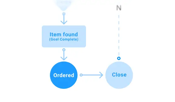
This stage is all about the final screen that your user will see after completing their journey. What text/CTA (Call to action) will help the user complete the goal you have in mind for them? This final text could be purchasing an item or confirmation that a subscription has been made. After the final action is complete, it is also important to decide which page or screen will be shown post-conversion. Here is an example of a final interaction on your diagram:
The most commonly used elements of the user flow diagram and what they stand for
Now that we’ve covered how to create the basic structure of user flows, we will discuss the most common shape elements that are used in user flow design and what they commonly represent.
Rectangle
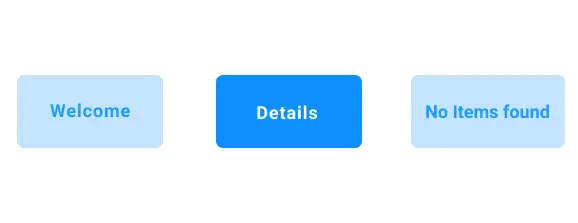
Rectangles are used to represent a web page or a mobile display screen without the necessity for a user to make any decisions.
Line with arrows
Lines tie the diagram together and show the path of the user from block to block.
Circle
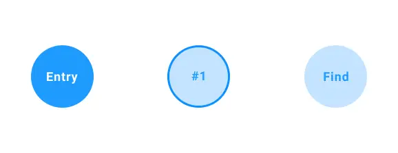
Circles are most commonly used to display an action that must be taken by a user, which might include selecting an item or sending an order.
Diamond
Diamonds are also known as “decision diamonds”. Unlike other shapes that might have different purposes, diamonds are always connected to a decision that needs to be made. The answer to the question the diamond is containing will lead the user through different paths on the diagram. For example, the question could be: “Do you already have a subscription?” from there, two paths would be spawned; one where the user responds “yes” and another where they respond “no.” If need be, a third option for “I don’t know” could also be accounted for.
It is important to mention that there are no hard-and-fast rules to creating user flow diagrams, there are only suggestions on how to get the results in the fastest time. You can modify these suggestions as you see fit, as long as you will end up with a clear and understandable chart in the end. Using previously established conventions, such as shapes, will help ensure your team members will be able to easily understand the diagram.
User flow diagram: Tips and best practices
Let’s conclude with some advice on how to improve the elements of your chart and avoid common mistakes.
- Create meaningful labels, with the most important being the title of the chart. State clearly what the diagram represents, and for each step make the make the label concise
- Avoid using all caps for labels, as they can decrease readability
- Use colors as a coding system for your elements, and not for stylistic reasons. Each color should represent a particular type of block
- Don’t forget to add a legend to explain what the colors and shapes stand for
- Stick to one direction when you create your flowchart and make it logical; tell a clear story
- Limit the number of decision points and use only necessary elements.
- After finishing, revisit your diagram after some time has passed and remove everything that doesn’t have value for this particular user flow diagram
Some examples of diagrams
![]()
FAQ
How do I create a user flow diagram?
You need to first understand who your customer(s) are before you can design or define a user flow. Once you’ve collected data (both quantitative and qualitative data) on your customer(s), choose one clearly defined audience and design a specific user flow where they accomplish a specific task or goal. For example, what is the user flow for a new prospective customer that may be interested in signing up for a free trial of your SaaS product? You can capture these flows using a customer journey map or a simple flow diagram, depending on how much information you are trying to capture.
What is a user flow diagram?
It is a chart that helps identify and eliminate dead ends for users and provides them choice through interaction. It illuminates the journey of possible steps and decision points from site/app entry to the desired outcome/goal. A user flow diagram also helps identify and eliminate dead ends, but it seems as if it does more than that.
What is the difference between customer journey and user flow?
User flows are a zoomed-in view of how a user goes about a task, while customer journeys are a zoomed-out view. Journeys capture the key steps that a user might take online and offline. Journeys aim to capture the key touchpoints that a system has with the customer, but are meant to also capture their overall interaction outside your system to see where points of friction may exist and identify opportunities to streamline the path to a successful conversion.
How do I test user flows?
You can test flows by designing clickable prototypes of your proposed experiences and having users attempt to perform a task or series of tasks. This is often called usability testing, and can be done both in a moderated or unmoderated environment, depending on the research outcomes you are trying to achieve. Moderated tests let you understand more of what is behind customer behavior by allowing moderators to ask live questions and dig deeper into real time user behavior. Unmoderated tests allow you to scale your research insights by having users perform tasks on their own, allowing you to record basic metrics like time-on-task and task success.
How to improve user flow?
Comprehensive analysis of the different pathways a user can take is key to streamlining the user flow. Make sure to eliminate dead ends and provide decision points in logical places where users encounter pathways that lead to an endpoint. Validate the necessity of steps and reduce them where possible when they are extraneous to the desired end goal.


