

An excellent website user experience operates logically and efficiently without drawing undue notice, much like a well-laid-out grocery store with clearly marked aisles that have large signage. Accordingly, the designers’ ultimate goal is to provide users with a seamless, intuitive user journey with a logical and easy way to locate something they are looking for.
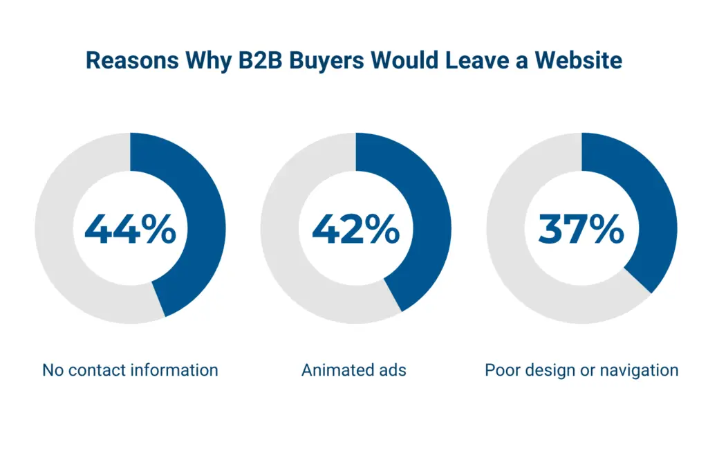
User experience consists of multiple elements with one of the main elements being the design of the website navigation. According to Top Design Firms, 50% of consumers believe that a website design is important to a company’s brand, with 42% of people noting they will leave a website because of poor functionality.
What is website navigation design?
Poor functionality includes the lack of performance from the Back-end programming and bad page navigation. Streamlining your website navigation helps ensure users will experience a positive, cohesive journey through your site.
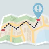
Navigation is the essential means for locating information on your website or wayfinding. Well-designed navigation is purposeful and should reflect the mental model by which users think about locating information on a website. Navigation types may include:
- meta navigation (topmost part of the page)
- primary navigation (typically located under meta navigation)
- secondary/tertiary navigation (can be via the dynamic drop-down menus or live underneath the primary navigation as a horizontal listing or sidebar)
- footer navigation (at the bottom of the page)
Website navigation design is the discipline of implementing effective and convenient ways for users to navigate through a website or mobile application. A well-designed navigation structure adds to the credibility of your website, and boosts users’ confidence in your ability to implement proper UX. Elements of excellent navigation design include:
- consistency
- well-defined hierarchy of relationships (meta nav, primary, secondary, tertiary, footer, and search)
- users’ mental model
- simplicity
- conventional UI elements
- frictionless experience
- the usage of conventional patterns
The importance of having effective website navigation structures
According to Statista, last year there were 3.48 million Android apps and 2.22 million iOS apps. Web tribunal claims that there are up to 400 million active websites right now. Each of these entities has its own unique navigation elements.
Imagine the level of competition, even if your niche or industry is not that big. Your potential customers are used to a great and thought-out user experience. Without a seamless navigation structure on your website, you will be at risk of losing your potential customers and ultimately losing revenue. This is the biggest reason why you should focus on this aspect while creating your website.
“People ignore design that ignores people.”
— Frank Chimero, Designer
The most common patterns in website navigation design
There are multiple types of website navigation mechanisms available. In a real product implementation, there is often a combination of those mechanisms used, in order to achieve product goals.
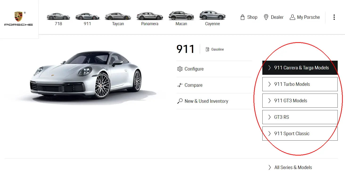
Breadcrumb menu
Breadcrumbs, also known as a breadcrumb trail, is a secondary navigation system that shows a user’s location on a site or web app. The term originates from the Hansel and Gretel fairy tale in which characters left a trail of breadcrumbs in order to return home.
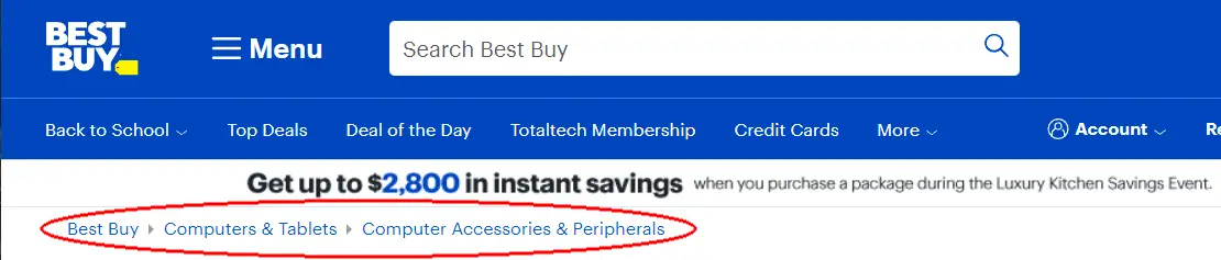
As you see, the breadcrumb menu is a great choice for an e-commerce-like website that has deep, hierarchical subcategorization.
Hamburger menu
Let’s move to one of the website menu types that is more popular on mobile apps, but is also being used more and more on desktop views too. It has nothing to do with food or restaurants, it’s often just three bars that resemble a hamburger and after being clicked or tapped offer users more options to move to other places. They’re used as space savers and/or attempts to keep the UI overly simple. However, studies have shown that despite the global use of hamburger menus, they are not as effective as you might think and that’s primarily based on discoverability.
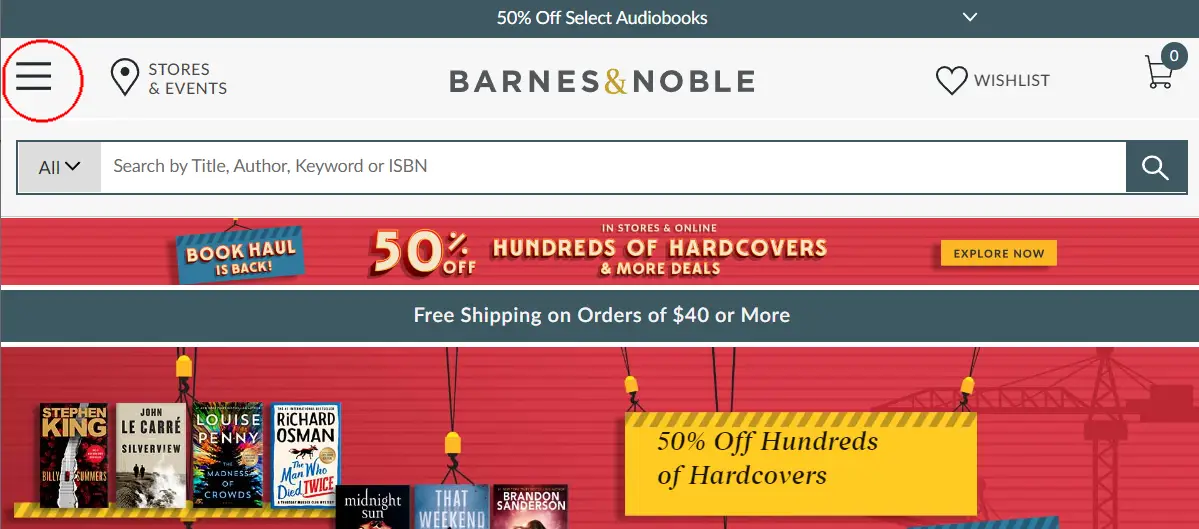
Here is an example of a hamburger menu used by Barnes & Noble (top-left):
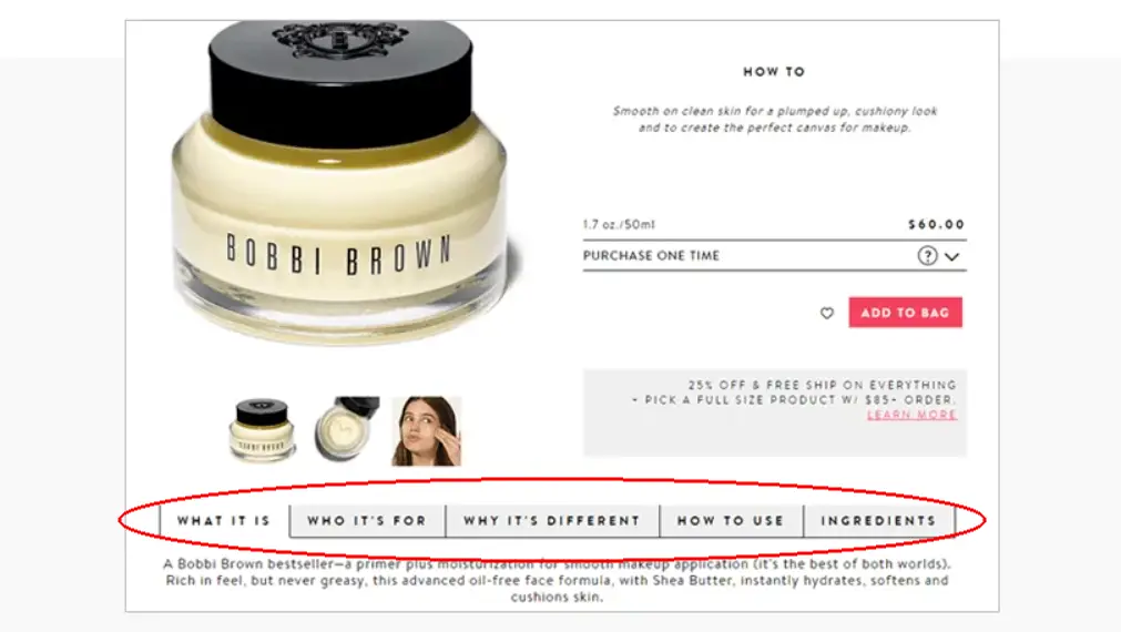
Tabs
This is another mechanism popular in mobile applications. This pattern is used to save on vertical space by displaying different types of information across tabs, but information that is collectively relevant to the primary focus of that page. The tabs are placed on the top or the bottom of the screen. Here is an example of tabbed menu navigation:
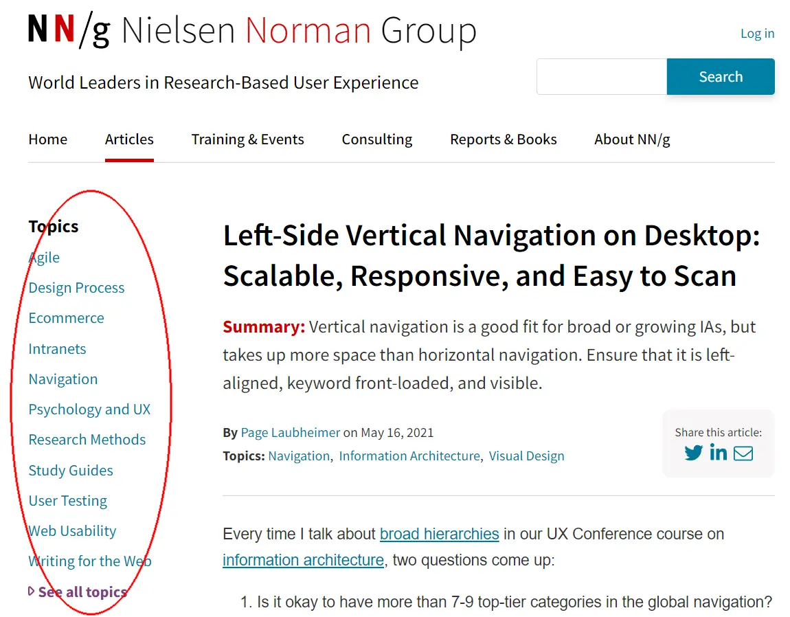
Vertical navigation
Most commonly placed on the left side of screens, the vertical menu takes a large chunk of a screen and includes links with primary, secondary, and tertiary levels of website navigation. From a design standpoint, using this mechanism is helpful when the user already has to see a lot of information on the main screen, and vertical navigation helps to add even more options in a convenient way. Here is an example:
Call-to-action (CTA) buttons
When you need a user to conduct a key action, whether it is signing up, purchasing, or downloading something, placing CTA (Call-to-action) buttons in easily noticeable spots on your website or app is key.
Key elements to a successful website navigation design
Now that we have determined the most common patterns and the importance of having clear navigation, let’s discuss what makes an effective design. Here are some important elements that can improve the experience of your users when browsing a website or mobile app.
Content clarity
Everything must be obvious and intuitive at first glance. That means clear labels with an understandable direction of where the user will end up after clicking or tapping on them.
It is very important to keep the design elements consistent throughout the entire design. This will make your users more comfortable and allow for easier comprehension while they navigate through pages. Make sure that website navigation buttons have labels and icons that are 100% consistent with the pages the buttons lead to.
Yes, there are cases when you can stand out among competitors with fresh design ideas and unique texts on your buttons, but most of the time clear and understandable buttons are the best practice.
Meaningful labels
Web page navigation bars for top-level navigation categories on your website are both a way to give users more contextual information and elevate your website in terms of SEO. For example, your website sells software development services, and you have ‘services’ written on one of your key buttons. Is that label clear enough for the user? What if you make a few different sections that will include specific names like IT consulting services, AI/ML development, and Big Data analytics. With those descriptive names, you will make it easier for users to navigate and with the SEO benefit, possibly attract new visitors from Google.
The more informative navigation categories are, including relevant labels and keywords, the more intuitive your users will find navigating your site or app.
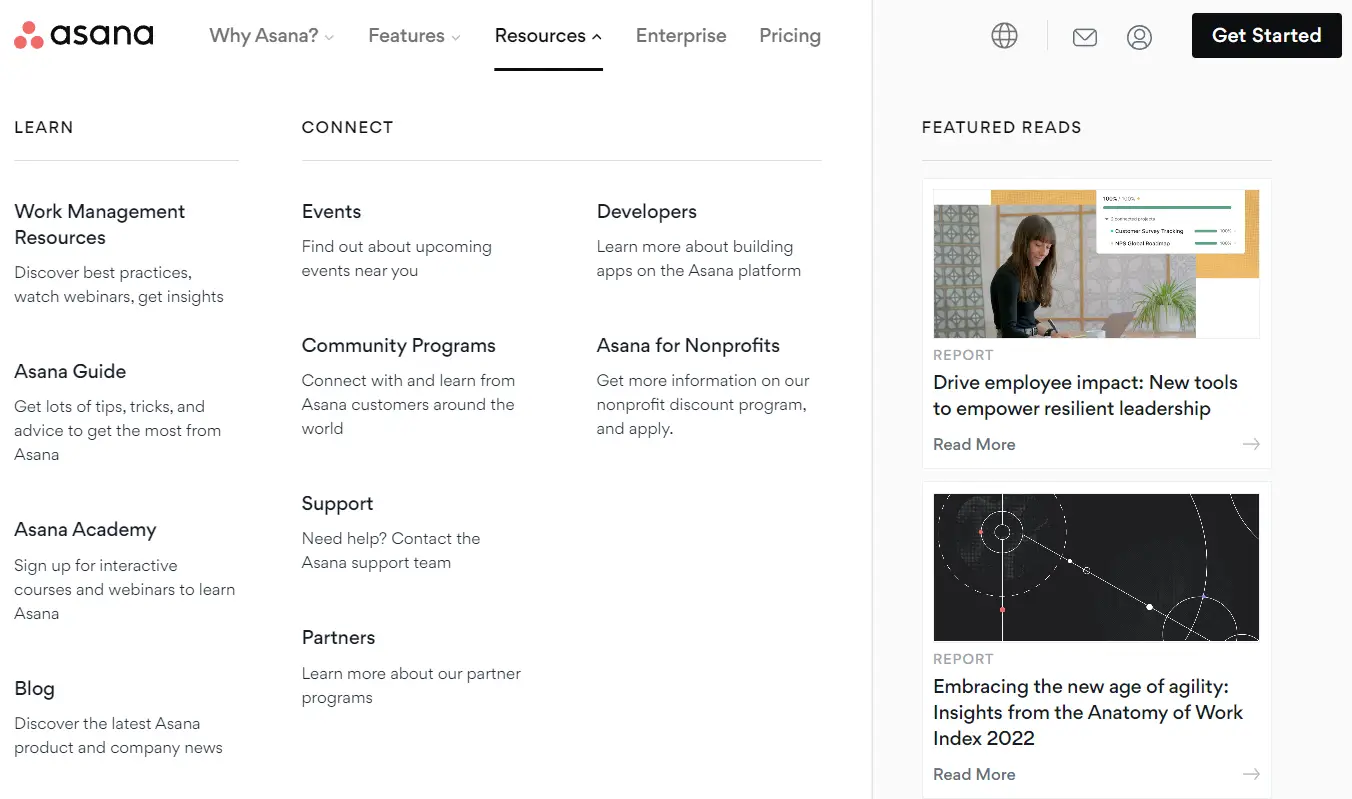
Mega menus instead of drop-down menus
While drop-down menus are very popular, they are not perfect. In fact, none of the approaches are – it’s all about context. With drop-down menus, there are two major setbacks: they can be hard for search engines to crawl, and they can make some pages harder to find for users.
Here is an example of a drop-down menu:
Consider using mega menus, wherever you can. Mega menus are much bigger, already divided into contextual groups, they are visible at once and save the users from additional scrolling. Here is an example of a mega menu:
Connect navigation design to user goals
One key site navigation best practice is to focus your design on a target group of users, which you can define by creating user personas. Find out what needs your target groups have and try to adjust your navigation in accordance with those. Some of the user questions you need to answer during this process are:
- How can I quickly find the item I need and purchase?
- What are the signs that the content is trustworthy, and the website is safe?
- If I have questions, can I find help easily and or contact support?
Create your own user scenarios, to connect the navigation of the website with user goals!
Leverage navigation cues
Simply put, navigation cues help the user understand their current location on the website. Help users to not get lost using consistent logos and branding, informative page titles, competent visual design, and breadcrumbs, etc.
The combination of the aforementioned elements will create trust with your users and provide a more intuitive experience that won’t have them reaching for the browser/app ‘back’ button.
Conduct proper prototyping and testing
Prototyping will give you an opportunity to determine which types of navigation work better for your website and help you tune up a signup flow, purchase flow, and user experience in general.
Make sure to leverage testing tools such as Optimal Workshop, UserTesting, and HotJar, to save time and money.
| Core elements for a successful navigation design | |
| Content clarity | Make everything obvious, intuitive, and consistent from the content standpoint |
| Meaningful labels | Make sure that your names are as specified as possible |
| Mega menus | Consider replacing drop-down menus with mega menus where it makes sense |
| User goals-oriented | Conduct research to determine the goals of your users and form key user personas and/or segments |
| Navigation cues | Do whatever you can to make sure that users know their location on the website at each particular moment |
| Prototyping and testing | Put in additional effort to analyze what types of navigation for websites work better for your product or service |
Website navigation best practices 2023
Make hyperlinks obvious
Navigation and design are closely connected. Make sure that your design decisions will not affect the user experience negatively. For example, even with well-designed primary navigation, when your user can’t tell the difference between the color of text and a hyperlink, you are in trouble.
Review basic accessibility guidelines. Here is an official one and an unofficial one, the second will help you interpret guidelines easier.
Streamline your navigation bar
Don’t fall into a trap of adding too many or too few links in your header navigation bar. Conduct research and anticipate what actions users take on your website, but also try to model what they potentially want.
In case your menu becomes too cluttered, use the main heading with a sub-menu to prioritize and categorize links in a way you find convenient for the visitors.
Keep sidebars separate
Make sure that a sidebar is also visible, separated, and stands out from the other elements on the page. The most popular choice is to accomplish this with a different background color compared to the body.
Think about the footer
Maximize the usage of space in your footer. You don’t have to add a lot of links, but make the added links count! A common practice is to duplicate the header navigation bar in the footer, so your users will not need to scroll the page up to get to the links they need. Some, duplicate the links from the header and add some more useful links in accordance with your navigation vision.
Ensure 100% mobile responsiveness
In 2023, if your website navigation doesn’t work properly on a mobile screen, your user’s experience is over before it even begins. If you don’t go with custom development, make sure that you pick a mobile-responsive theme from your content management system.
Popular mobile navigation implementation often includes logical hamburger menus, shortened text labels, and buttons/links that are easy to tap on mobile screens.
What are some bad homepage navigation design cases?
To ensure that your navigation will end up great, let’s review some examples of what you should avoid in the page navigation design process.
The users should look for navigation
Some designers are looking to save space and use solutions like hamburger menus to hide navigation menus and make them available on demand. The problem with this is that a percentage of users won’t click on icons and find out that your navigation even exists. Additionally, you don’t need to increase task completion for the visitors. Ensure your main page navigation design elements are visible at first sight.
Navigation elements in unexpected places
Always consider putting elements of your navigation in the most logical places on the page. Just like with hidden menus, some users won’t even notice your menus and will think that this functionality is absent.
Too many top-level options
Having a lot of visible navigation options on the top level of your homepage may be a bad idea. The sum of mental and physical effort should be minimized for your visitors, and the limited number of navigation options can help here.
There is psychological research called The Magical Number Seven, Plus or Minus Two by George A. Miller, that states that human short-term memory is able to hold seven items, plus or minus two. So, it will be a good idea to keep the number of navigation options to less than seven, in order to help visitors process the information more easily.
Think through the order
When you work on a design, don’t make the mistake of not paying enough attention to the order of options. It will be a smart move to start with the most important options and finish with the least important. While prioritizing, you should also consider the Serial-position effect, in which items in the beginning and at the end are considered to be the most effective, however, items in the middle are harder for our brain to memorize.
Ignoring search functionality
The search functionality can help your visitors to find particular content faster than looking through menus, so make sure to add it if possible.
Having broken links
It seems obvious, but make sure that links on your website are working just as intended. One broken or misdirecting link can ruin even the best navigation design.
This often happens during the website update process, so if you add new content or add new plugins, always double-check if everything works properly because user experience and the brand image are on the line!
Conclusion
While often ending up unnoticed, a proper navigation design can make or break your website or mobile app. While all the mechanics remain invisible, perfecting your navigation can take time but is definitely worth it. A great user experience is a combination of delightful visuals, carefully planned content strategy, and consistent and logical navigation design. If you are looking to improve your navigation, look to the experts in UX design and development, to make it simple for your customers to find your products or services. Let’s talk.
FAQ
What is navigation on a website?
Navigation is the essential means for locating information on your website or wayfinding. Well-designed navigation is purposeful and should reflect the mental model by which users think about locating information on a website. Navigation may include meta navigation, primary, secondary, tertiary, footer, and even search.
What is the navigation menu?
A navigation menu is a dynamic way to surface sub-navigation items and/or content directly from the primary navigation menu/bar. Navigation menus do not have to be present on all primary navigation. They typically exist when there is more information that needs to branch out from the main items.
What makes good website navigation?
Good website navigation consists of such components as consistency, a well-defined hierarchy of relationships (meta nav, primary, secondary, tertiary, footer, and search), users’ mental model, simplicity, conventional UI elements, frictionless design, and conventional patterns.
What are the common mistakes that you can encounter during the page navigation design process?
The common mistakes include: making the navigation hard to find and counterintuitive for users, having too many options in a top-level menu, not thinking about the order of options, not having a search function, and having broken links.