


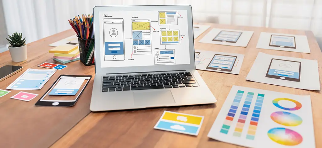
Aesthetics and functionality are key to user experiences that stand out in a crowded digital market. The primary purpose of user experience (UX) design is to facilitate seamless and efficient digital interactions. But it’s also vital to create visually stunning interfaces that captivate and leave a lasting impression.
Ensuring your work is both beautiful and highly functional is no easy feat. This guide explores how to balance aesthetics and functionality in user experience design. We also examine the key considerations and best practices for harmonious designs that improve engagement and drive results.
The Importance of Aesthetics and Functionality in UX Design
Aesthetics refers to a design’s visual appeal and sensory experience. In the context of user experience design, aesthetics encompasses elements like color, typography, layout, imagery, and overall visual coherence. These elements are crucial because they shape the user’s first impressions and emotional response to a digital product or interface.
A visually appealing design can captivate users, make interactions more enjoyable, and foster a positive brand association. Professional-looking digital products reinforce overall usability. Aesthetics can also differentiate a product, communicate its brand identity, and make it memorable.
Ultimately, aesthetics isn’t just “window dressing.” It’s an integral part of effective UX design that boosts user satisfaction, conversions, and brand loyalty.
Functionality in UX Design
Functionality refers to a design’s practical, task-oriented aspect that enables users to accomplish their goals efficiently and effectively. In UX design, functionality encompasses elements like information architecture, navigation, interactivity, and the overall usability of the interface.
Functionality is critical because it determines how well a digital product or service meets users’ needs and supports their workflows. A highly functional user experience design ensures users can easily find what they want. It helps users complete key tasks and accomplish their objectives with minimal friction or confusion.
Effective functionality is characterized by an intuitive and user-friendly design. It’s the groundwork of a delightful user experience. Even the most aesthetically pleasing design will fail to deliver value without strong functionality.
Aesthetics vs Functionality: Which to Prioritize
While aesthetics and functionality may seem like competing priorities in user experience design, they’re deeply interconnected. Aesthetics without functionality leads to visually appealing designs that are frustrating and ineffective. Conversely, functionality without aesthetics can result in utilitarian and uninspiring interfaces.
The most successful UX designs strike a careful balance. Aesthetics can enhance functionality by making interfaces appealing, uncomplicated, and accessible. Functionality, in turn, can elevate aesthetics by ensuring that visual design choices serve a clear purpose and support the user’s goals.
Different industries and product types may naturally place a greater emphasis on one aspect over the other. For instance, a fashion eCommerce site may prioritize aesthetics to create an immersive, aspirational brand experience. Meanwhile, a healthcare or financial application may need to focus on functionality to ensure users can complete critical tasks quickly and accurately. However, the ultimate aim should be to find the optimal balance.
UpTop Perspective
Great UX is the engineering of the entire experience not just the design of the screens.
Pitfalls of Prioritizing Aesthetics Over Functionality
- Visually stunning but difficult-to-use interfaces can lead to user frustration, task failure, and product abandonment.
- Elaborate visuals that distract from or impede the user’s ability to accomplish key tasks can negate the positive impact of aesthetics.
- Overemphasis on aesthetics can undermine a product’s usability, accessibility, and overall value to the user.
- Designs prioritizing form over function may damage a brand’s credibility and trustworthiness, especially in utilitarian or mission-critical applications.
Pitfalls of Prioritizing Functionality Over Aesthetics
- Purely functional interfaces, without any visual appeal or emotional resonance, can feel sterile, uninspiring, and less engaging for users.
- Neglecting aesthetics can make it more difficult for users to navigate an interface intuitively, understand information hierarchies, or feel a sense of delight and discovery.
- A lack of aesthetic consideration can make the experience feel outdated, generic, or lacking in personality, even if the functionality is strong. This can give a poor first impression.
- An overly functional approach may be appropriate in certain industries or use cases. However, in many digital products, it can negatively impact user satisfaction and product adoption.

Strategies for Achieving Balance
To craft exceptional digital products, find creative ways to harmonize design and operability. Here are several effective strategies to help you strike the right balance:
1. Start With User Needs
The foundation of any successful user experience design lies in deeply understanding your target audience’s goals, desires, and pain points. Place the user at the center of the UX design process to ensure that both aesthetic and functional considerations are grounded in real-world utility. This user-centric approach helps prevent aesthetics from becoming undirected add-ons and features from feeling cold and detached.
2. Prioritize Usability
While visual appeal is important, usability should be the primary driver of design decisions. Aim to create interfaces that are intuitive and accessible, with a clear information architecture and seamless task flows. Then, layer on aesthetic elements that enhance the user experience without compromising functionality.
3. Embrace Iterative Design
Achieving the ideal balance isn’t a one-time endeavor. Be willing to test, gather feedback, and refine your designs continuously. This iterative process allows you to identify opportunities to enhance both the interface’s visual appeal and practical utility. Regularly solicit user input to ensure the design stays centered on their needs.
4. Leverage Data and Analytics
Quantitative data and user analytics can provide valuable product and design improvement insights. Track metrics like task completion rates, user engagement, and conversions to find where the interface falls short.
5. Maintain Design Consistency
Consistent design patterns and visual language are essential for a cohesive, intuitive user experience. Users can more easily navigate and interact with the interface when aesthetic and functional elements are aligned. Design consistency reduces user frustration and confusion. It also reinforces brand recognition and improves brand perception.
6. Cohesion, Clarity, and Simplicity
When you strive for clarity and simplicity, you allow users to focus on their tasks without being distracted by visual noise or puzzling interactions. Cluttered or overly complex designs can take away from the core functionality. Conversely, intuitive navigation, minimal steps to complete tasks, and the use of familiar user interface (UI) patterns enhance ease of use.
To establish a cohesive design system that aligns with your brand identity and supports the practical needs of users, consider the following:
- Color schemes that enhance readability highlight essential information and create a visually appealing palette.
- Icons and imagery that are visually consistent, recognizable, and serve a clear functional purpose
When these visual elements work together harmoniously, users can intuitively perform the desired actions rather than being distracted by inconsistent or disjointed aesthetics.

7. Intuitive Navigation
A well-structured, clean navigation menu looks professional and allows users to easily find and access the information or features they need. Organize content logically and provide clear, concise navigation options to guide users through your website or application quickly. This improves task efficiency and user satisfaction.
8. Typography and Readability
Well-chosen fonts, text layout, and readability considerations can enhance the visual appeal of the interface. It also ensures users can easily consume the content.
Aesthetically, typography can complement the overall design language and contribute to the interface’s visual sophistication. Functionally, good typography improves readability, reduces user strain, and facilitates efficient information processing. With the right balance between aesthetic and functional typography, you can create highly usable and captivating interfaces.
9. Emotional Connection Through Design
Carefully crafted visual design can evoke positive emotions and build trust. Consider how the color choices, imagery, and overall design style can contribute to the desired emotional response. For example, a soothing color palette and calming illustrations may be appropriate for a meditation app, while a vibrant, playful aesthetic could better suit a social media platform.
Incorporate emotional design elements that align with your brand and user needs to create attractive and engaging interfaces. This emotional connection can increase user loyalty, advocacy, and overall satisfaction with the product or service.
Every design decision, from imagery to interactive elements, tells a story about a brand and its values. When executed with intention, these details transform a product from functional to delightful, fostering a stronger emotional bond with users.
10. Micro-Interactions
Well-designed micro-interactions, such as button animations, hover effects, and form validations, can improve an interface’s usability and boost its visual appeal. These subtle yet impactful design elements can enhance the overall user experience. Specifically, they provide visual feedback, guide user actions, and make the interface feel more responsive.
11. The Role of White Space
Although often overlooked, white space significantly balances aesthetics and functionality in user experience design. This refers to the unmarked areas in a design, which can be any color, not necessarily white.
White space provides visual breathing room and enhances the interface’s artistic merit. Functionally, it helps focus users’ attention on key elements and improves readability and understanding.
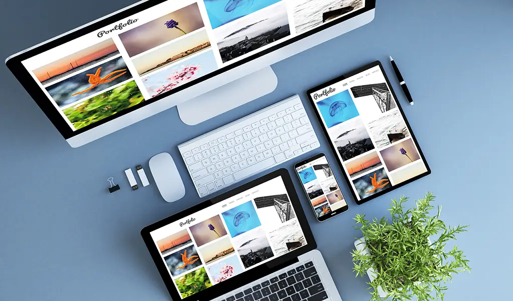
12. Responsive Design
In responsive design, the interface adapts seamlessly to different screen sizes and devices, a crucial aspect of modern UX. Aesthetically, responsive design ensures that the visual elements maintain their integrity and appeal across various devices. Functionally, it enables users to complete tasks and interact with the interface effortlessly, regardless of their device.
Effective user experience design requires input and collaboration from a diverse team of specialists. Bringing together visual designers, interaction designers, user researchers, and subject matter experts helps ensure that both aesthetic and functional considerations are thoroughly vetted. Through a cross-disciplinary dialogue, UX teams can develop holistic solutions that strike the right balance.
A Successful Balancing Act: Case Study
Apple and Airbnb are prime examples of digital products that are visually pleasing, highly effective, and intuitive for users. They strike just the right balance between aesthetics and functionality.
Apple iOS
Apple’s iOS interface is known for its clean, minimalist aesthetic and high functionality. Simple icons, intuitive gestures, and consistent design language create an attractive interface that’s also easy to navigate and use. Features like Control Center provide quick access to key functions while maintaining a sleek look.
Airbnb
Airbnb’s website and mobile app showcase a beautiful visual design with large, high-quality images of properties. At the same time, the interface provides powerful search and filtering capabilities, clear pricing information, and an easy booking process. The aesthetics draw users in, while the functionality allows them to find and book accommodations efficiently.
There are several key factors that make these approaches successful. For instance:
- They prioritize user needs and align the design with their target audience’s preferences and behaviors.
- The design achieves visual clarity and simplicity without compromising functionality.
- They develop a consistent visual language that supports the brand identity and enhances usability.
- They foster an emotional connection through thoughtful aesthetic design choices.
- A progressive enhancement ensures core functionality is accessible across devices.
- They regularly conduct usability testing to identify areas for improvement.
Holistic User Experience Design with UpTop
When you prioritize a digital product’s visual appeal and practical utility, you can craft interfaces that captivate users, facilitate seamless interactions, and leave a positive, lasting impression. The key is to take a holistic approach. Ground design decisions are made to understand user needs and behaviors deeply. This user-centric perspective ensures aesthetics and functionality work harmoniously to deliver maximum value.
At UpTop, we specialize in modern user interface and user experience design. Our team of multidisciplinary experts collaborates closely to marry striking aesthetics with cutting-edge functionality. We leverage data-driven insights, iterative testing, and proven best practices to create digital experiences that delight users, drive engagement, and foster long-term loyalty.
Let us help you find the perfect balance. Connect with our experts today and take your digital product to new heights.