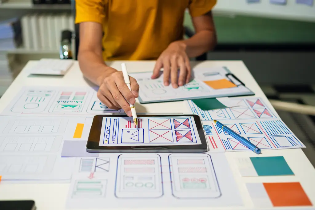
The debate between high-fidelity and low-fidelity prototypes continues to challenge designers and product teams. High-fidelity prototypes offer a realistic, polished representation of a digital product but require more time and effort. In contrast, low-fidelity prototypes are quicker and easier to produce but may lack the detail needed to convey the full design intent.
Finding the right level of fidelity is key to communicating effectively with stakeholders, iterating efficiently, and delivering meaningful user experiences. This article explores the strengths and tradeoffs of each approach and introduces a hybrid workflow that helps teams move from concept to execution more seamlessly.

Understanding Prototype Fidelity
Prototypes are essential tools for validating ideas and refining digital products. Fidelity refers to how closely a prototype resembles the final product in terms of visuals, functionality, and interactivity.
- Low-fidelity prototypes typically take the form of sketches, wireframes, or basic click-throughs. They’re useful for early ideation, rapid iteration, and gathering broad feedback.
- High-fidelity prototypes simulate real user experiences, often including visual design, micro-interactions, and near-final content. They are ideal for stakeholder presentations, usability testing, and developer handoff.
Each level of fidelity serves a purpose in the product development cycle, and choosing the right one depends on project phase, audience, and goals.
High-Fidelity Pros and Cons
Pros:
- Clarity: Stakeholders and users better understand polished prototypes, which reduces ambiguity.
- Realism: Interactions and visuals mirror the final product, making testing more reliable.
- Developer alignment: High-fidelity specs support smoother design-to-dev transitions.
Cons:
- Time-consuming: Requires more effort to design, iterate, and maintain.
- Risk of over-investment: Early feedback may force teams to discard highly detailed work.
Low-Fidelity Pros and Cons
Pros:
- Speed: Quick to produce, making them ideal for early-stage ideation and experimentation.
- Flexibility: Easy to revise based on team or stakeholder feedback.
- Cost-effective: Less time and fewer resources are needed.
Cons:
- Lack of detail: May confuse or underwhelm stakeholders unfamiliar with UX processes.
- Ambiguity: Users might misinterpret flow, layout, or interaction intentions.

Why You Don’t Have to Choose Just One
The most effective teams don’t lock themselves into a single fidelity—they combine both. A progressive prototyping model allows designers to start simple, test early, and refine over time.
This approach mirrors how many modern design teams work:
- Sketch and wireframe rough ideas for exploration and team alignment.
- Validate early-stage flows using low-fidelity click-throughs or frames.
- Refine visual design and micro-interactions in high-fidelity tools like Figma, Framer, or Axure.
- Handoff polished assets to developers with specs, design tokens, and annotations.
By increasing fidelity incrementally, teams reduce risk, maintain momentum, and stay aligned with both business and user needs.
Prototyping with Purpose
The real question isn’t “Which is better?” but rather, “What level of fidelity is right for this stage, this user, or this decision?” Whether you’re validating a core concept or finalizing a user journey, the best prototype is the one that gets the right feedback at the right time.
Flexible, iterative prototyping allows teams to experiment, communicate clearly, and stay efficient without overcommitting prematurely. When used intentionally, both low- and high-fidelity prototypes become powerful tools for collaboration, insight, and impact.
Want to develop a smarter prototyping workflow for your team? Connect with our design experts to explore how strategic prototyping can elevate your product experience.


