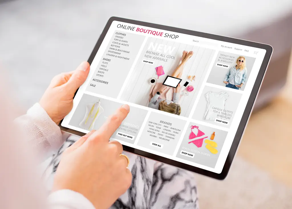
As eCommerce continues to grow, consumers are consistently given more freedom than ever when it comes to when they shop, where they shop and how they shop (for example, using their phone when they’re on the go versus on a desktop at home). In fact, according to findings from the Center for Retail Research, online retail revenue in the U.S. is expected to increase 14 percent by the end of 2015 when compared to the previous year. This number is expected to grow in the coming years as more Internet-enabled devices are introduced to the consumer landscape and as retailers continue to competitively differentiate themselves online.
In order to remain competitive, businesses must adapt to the online shopping model. However, don’t underestimate the challenge associated with developing a reliable, user-friendly website.
Don’t Overlook Your Website Navigation Design
One of the greatest – and often overlooked – challenges when creating or updating a website involves the website’s navigation design.
Improving this aspect of the online shopping experience for your customers may not seem as attractive (in terms of ROI) as sale prices or customer reviews do however, proper site navigation is without question something that can make or break a consumer’s trust in your brand. Just consider that 88 percent of users won’t return to a site if they’ve had a bad user experience, which of course, includes site navigability.
If a site is oriented well, potential clients won’t even notice; in other words, the user experience will be so ubiquitous and well-designed that customers won’t think twice when seamlessly navigating your site. When a company’s site is oriented poorly, however, there is a good chance it will lose customers or prospects for the long term.
To help you avoid this common pitfall, below are three common website navigation designs that should be avoided at all costs:
Unclear Labeling
The different labels that appear at the top or side of your company website—a portion of your website that can be referred to as the “top or side navigation bar”—should clearly state your company’s core competencies (i.e., broad product and service categories, a sales section, or an about page to showcase who you are as an organization, etc.) and should direct your visitors to these various portions of your site.
For example, if you are an eCommerce mattress retailer, your labels may include “Mattresses,” “Beds,” “Furniture” or “Accessories.” If prospects or customers on your site have to actively stop and think about where the specific products or information they’re searching for live, then odds are that you may have already lost them.
To determine how you should approach labeling, consider an industry-standard saying that I have seen work time and again:
“It is more important that your customers know how to find what they are looking for than to demonstrate a particular attitude or creativity.”
For instance, rather than saying “What We Do” as a service-based business, label this category “Services and Products.”
While this label may not showcase your brand’s creative side, it is more important to be concise and avoid overcomplicating the first moments a customer has with your brand. This is infinitely more important to customer acquisition and retention.
Disorganized Products and Content
Just as with your brick and mortar storefront or even your product warehouse, goods can easily become disorganized, misplaced and even forgotten about if they’re not found easily. So, consider the ways in which your online content can become easily disorganized as well.
For example, it is important that content and products are placed under the proper category headings (e.g., Tempur-Pedic’s bed base isn’t placed under the ‘Mattresses’ category but rather, under the ‘Adjustable Beds’ category).
While this may sound like a no-brainer, this is demonstrative of the need for navigation to seem intuitive to the end-user.
With the constant flux of new products coming in and old ones selling out, employee turnover and holiday sales, it is easy for a once organized website to become messy as products are loaded into the wrong categories or with incomplete information. Because of this constant change (a change that is natural in any eCommerce experience) it is important to continually assess your website and ensure product information is complete, accurate and up to date.
Missing Your Target Audience
Website navigation is not a “one size fits all” solution. Different businesses will naturally target different demographics. Having said this, it is essential when considering your website’s navigation that you have a firm understanding of what your customer-base look like.
Taking your product, business goals, customer personas and even testing results from different models into account, you may find that your audience is better suited for – and has perhaps already been adapted to – an interactive website design that doesn’t necessarily follow the classic ‘top bar navigation’ theme.
Take the Chickenbot website (an Italian food delivery company) for example. While they offer a sticky navigation at the top (one that follows the user’s scrolling of the website), it doesn’t serve as the main navigation per se.
The website as a whole offers different options for the user to click on options that would usually live in the top nav as they scroll down page. When a user sets their location or signs up for the program, a pop up menu from the right side of the screen appears providing the user with product and service availability, as well as prompts to fill out the rest of their order information.
Another option to consider is that if, through analyzing your customer data, you discover a large number of prospects are perusing your website via their tablets or smart phones (but are not converting into customers) you may want to consider creating a responsive or mobile website that caters to the unique motions and characteristics of the mobile experience i.e., make it easy for them to find and buy while they’re on the go.If you are targeting a contrasting demographic, chasing different business goals or even presenting a completely different product base than what the Chickenbot website model suggests, a more straightforward or classic design theme (as seen in our Mattress Firm example) may be warranted.
Conclusion
In the end, site navigation is key to turning first-time visitors into repeat customers. By avoiding these three common website navigation design mistakes, you can ensure that you are supporting the users’ experience by bolstering a trusting base, a strengthened brand, and increased revenue.