


UX design plays a vital role in the overall success of your website or application. It’s not uncommon then that companies put a large number of resources into developing UX that is both highly functional and innovative for their user base. However, how do you know if you’re seeing a positive return on investment (ROI) when it comes to your investments in UX? The answer can be found through the measurements of key performance indicators (KPIs).
7 KPI Examples to Assess ROI in your UX Design
While there are many KPIs you can track, there are specific measurements that directly impact your bottom line.
1. Time On Task
Knowing how long it takes for your users to complete a task will give you valuable insight into the effectiveness of your UX design. “Tasks” can be any process that the company defines for its users, including filling out forms, completing surveys, making a purchase, or following through with other calls to action. Regardless of the task defined, it’s important to establish benchmarks on the length of time it takes for each task to be completed. In most cases, the less time spent on specific tasks, the better. And this data will help to monitor the performance of subsequent designs.
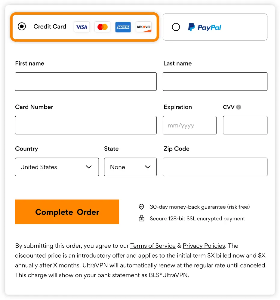
An example of this is how long it takes for a user to fill out a form. Be sure to include only necessary form fields and try to auto-populate data that your system already knows about the user (eg. name). Ensure that the form fields follow the logical flow for the end user’s mental model and what they expect. Every detail saves valuable time and increases the chances that the user will complete a specified task.
2. Use of Navigation Vs. Search
Every new development project should take into consideration the usability preferences of your target audience. While some users may prefer seamless navigation through a website or application, others may require better searchability. Measuring preferences of navigation vs. search when it comes to your UX design will help you to make improvements that make a difference to your users. Typically, you’ll want to strike a balance of intelligent navigation and intuitive search functionality rather than pitting one against the other. This will help to keep your UX open to a broader customer base and make the design more sustainable over time.
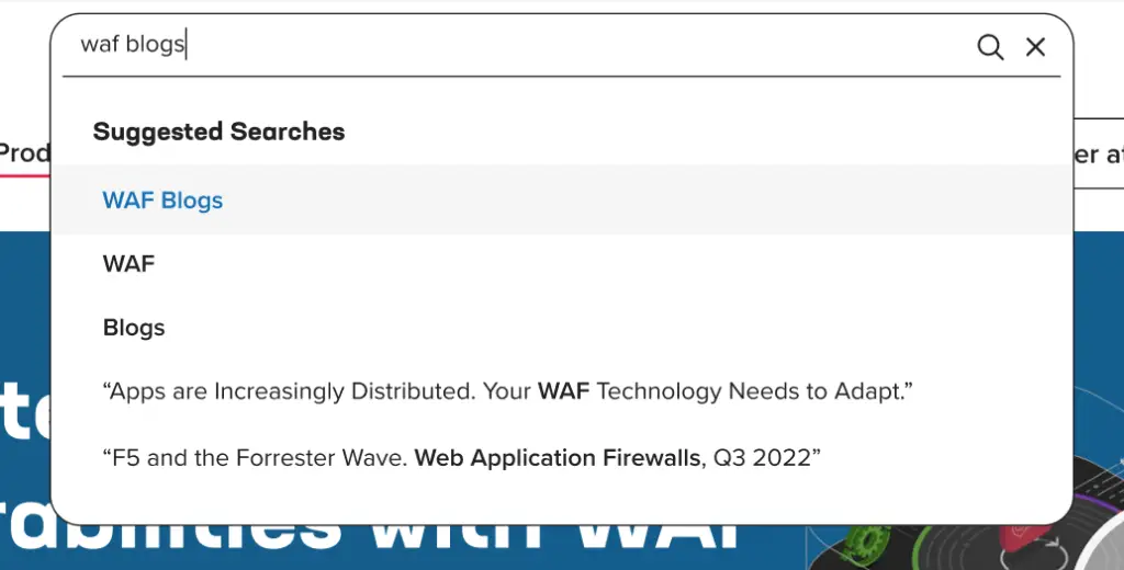
If your site’s primary function is providing extensive listings of information the user will need to logically search through, then search should be the primary feature of your navigation or UI. Specifically, you should use search with strong keyword associations because ordinary users may not be familiar with the taxonomy your algorithms depend on. Eg. ‘Immune System Providers’ = rheumatologists
Contrarily, use traditional navigation for top-level items that direct users to the main functions of your website or app.
3. User Error Rates
All UX designs should be user-friendly with a focus on improving the customer experience. However, no two designs are the same, and each of them may generate their own frequency of errors when users interact with them. These errors can happen when users improperly fill out forms, submit payment information, or forget to enter their credentials. While these issues may seem to be user-generated, recognizing consistencies around this measurement may show signs of inefficiencies when it comes to the overall structure of your UX.
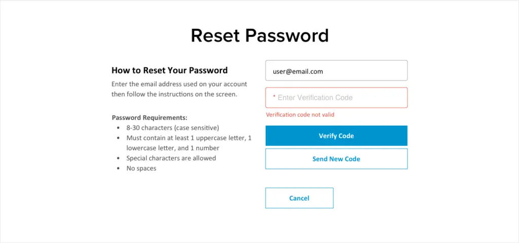
Think about the authentication experience prior to entering your member portal. There are a number of form fields to fill out whether you’re creating an account or resetting your password. If you happen to commit an error, how the error is displayed and then communicated back to the user is important. This design pattern is equally important once you’re inside the member portal, which may inherently have a different design pattern because of the system or technology in place. Inconsistency in your UX can be jarring, frustrating, or even cause errors for users as they are moving through your system.
4. Drop-Off Rates
Your UX design should be highly engaging while limiting the number of user drop-offs that you experience. Measuring the number and percentage of visitors who leave the conversion funnel is essential to ensuring your UX design is optimized correctly. This KPI will help you to identify common issues your design may be suffering from while showing you the effectiveness of your calls to action. Measuring your drop-off rates over time gives you the ability to conduct more in-depth analysis on every level of your UX design. This helps you gauge the success of simple or more substantial improvements.
Drop-off rates can be caused by a few things. Let’s imagine a user is trying to sign up for your email newsletter.
- First, a user might drop off because they couldn’t find the form on your website, even though it did exist. That would be classified as a navigation issue.
- Second, a user might drop off because the form they were looking for actually didn’t exist on the website. That would be classified as a capability issue.
- Third, there were technical issues along the way that didn’t allow them to reach their destination.
- Lastly, let’s say your user finally reached their destination, but the instructions provided was not satisfactory in terms of completing their task.
As you can see, there are many contributing factors to why users may drop off.
5. Conversion Rates
One of the more obvious KPIs that should be tracked when monitoring the ROI of your UX is your conversion rates. Without knowing the percentage of your users that complete an action or convert a sale, you won’t be able to track the profitability of your project. When measuring conversion rates, companies should consider if their current UX design is producing the number of actions they had hoped for. If not, conversion rate KPIs can help drive decisions towards needed UX design changes. Conversion rate measurements help to recognize the effects that adequate branding, usability, and accessibility can have on your UX design.

An obvious example of a conversion rate is the number of people that submit your contact form. It’s imperative to think through all of the factors that would lead someone to reach out for further communication in the first place and be sure that all of those factors are considered. You need to be sure you’re providing easy access to the form, clear instruction on its use and set expectations as to when they can expect a response.
But it goes beyond what information is on your website. If you do the proper research, you may find that prospective customers learn about your brand through friends or family, social media, or other means. Think about these touch points outside of your website and make sure that your company supports your brand promise and prospective customer needs where they might be. This can widen your funnel and lead to an increase in conversions if you do it right.
6. System Usability Scale (SUS)
When companies need an answer to the question “is my software or website easy to use?”, using a System Usability Scale (SUS) can help. System Usability Scales provide UX scores through short questionnaires that users take after using your software. The small surveys are typically quicker and less expensive than larger-scale focus groups and can provide valuable insights on your current UX.
The average scores that are calculated by a SUS typically show you how usable your design is and if users would recommend it to others. You can then use these scores as another benchmark to track as you implement changes or create new UX designs over time.
Prior to a redesign, run a SUS score questionnaire to capture the baseline of your existing system’s usability. Then, run the questionnaire after you’ve launched your redesign to measure the change. This method is a good way to keep track of the progress of your site or app over time.
7. Net Promoter Score
A critical measurement that companies should look at when evaluating ROI in UX design is customer loyalty and the potential for repeat business. Net Promoter Scores help to measure overall customer loyalty for your brand, products, or services. Net Promoter Scores are designed to help you segment your customers into one of three types, namely, Promoters, Passives, or Detractors. While the use of Net Promoter Scores has been mostly used when it comes to dealing directly with customers, they have been proven to help companies identify more significant issues in their UX design. As bad UX and software bugs are a common reason for Passive or Detractor-type customers, measuring Net Promoter Scores across your entire user base can be another valuable KPI to track over time.
NPS is another metric that, that when combined with a measurement such as SUS, will give your business a more complete view of your site and brand evaluation. There have been strong correlations with positive SUS scores and positive NPS scores.
While taking the time and resources to develop your UX efficiently is vital, it’s important to track its performance over time. Not only will this help to measure the ROI of your UX design, but it will also help you to create a more sustainable environment when it comes to the usability and accessibility of your products.
By tracking conversion and drop-off rates, the amount of time spent on tasks, and measuring the overall usability of your UX design, you’ll be able to ensure you’re meeting the goals of your company while providing a valuable user experience to your entire user base.

From Insight to Action
Measuring the ROI of UX design goes beyond aesthetics—it’s about proving the real business value of usability, efficiency, and customer satisfaction. By tracking KPIs such as time on task, error rates, drop-off points, and overall user sentiment, organizations can gain a clear picture of how well their design investments are performing. These insights not only validate UX efforts but also highlight opportunities for continuous improvement that drive measurable growth. Ready to ensure your digital experience is working as hard as it should? Get in touch with our team today to start optimizing your UX for maximum impact.