No two days at UpTop look the same. Our clients span healthcare, financial services, professional services, and enterprise technology. Some are private equity–backed and under pressure to scale quickly. Others are founder-led organizations that have outgrown their systems. What they share is not an industry. It is a pattern.
They are service-driven organizations powered by complex digital tools. And those tools are no longer keeping pace with the business.
At some point, growth exposes friction. Legacy systems slow down workflows. Customer portals feel dated. Internal tools require workarounds. Support tickets rise. Adoption stalls. Leadership begins asking the same question:
Why doesn’t our digital experience reflect who we are today?
This is the digital inflection point. And this is where UX modernization becomes essential.
At UpTop, we help technology-enabled services companies modernize the digital systems that power their service delivery. Our work goes beyond visual redesign. We reimagine how people interact with platforms, workflows, and data so technology truly enables performance, efficiency, and growth.
Here is how we do it.
A Structured, Flexible Approach Built for Modernization
Modernization cannot be chaotic. It requires clarity, alignment, and momentum. At the same time, every organization has unique constraints, timelines, and budgets.
That is why we bring a structured but flexible approach.
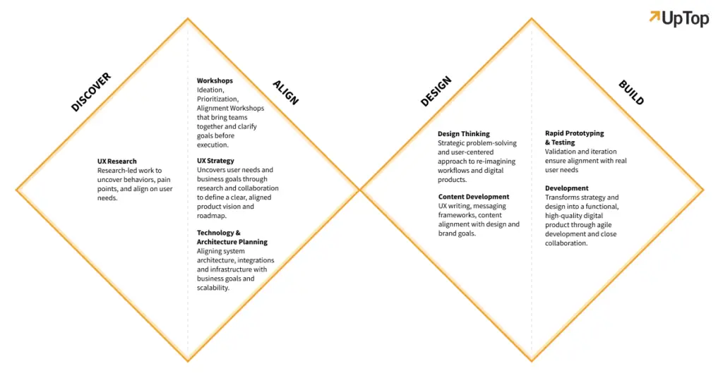
Our process begins with discovery, aligns strategy, validates solutions through research and prototyping, and moves into agile design and development. Engagements can be delivered end to end or in focused phases, depending on your needs.
We use the Double Diamond framework to guide our work. This method combines divergent thinking, where we explore broadly to uncover the right problems, with convergent thinking, where we narrow in on the highest-value solutions. It helps generate both velocity and value quickly.
Our process is also augmented by AI-enabled research, analysis, and iteration. AI helps us synthesize data faster, identify patterns at scale, and explore solution variations efficiently. It accelerates insight without sacrificing rigor.
The result is a modernization approach that is both disciplined and adaptable.

1. Discovery: Defining the Right Problem
Every successful modernization effort begins with clarity.
In many organizations, digital friction is visible, but its root causes are not. Executives see lagging KPIs. Product leaders see low adoption. Operations teams see inefficiencies. Employees feel frustrated. Customers feel confused.
Discovery is where we align these perspectives.
We conduct stakeholder interviews, working sessions, and cross-functional workshops to understand business objectives, operational realities, and technology constraints. We examine existing systems, workflows, and integrations. We map how value is delivered today and where it breaks down.
At the same time, we look outward to your users. For technology-enabled services companies, this often includes both internal users, such as operations or underwriting teams, and external users, such as clients or members.
Using journey mapping and service blueprinting, we identify friction at the intersection of people, process, and platform. We pinpoint where effort is highest and where modernization will create measurable impact.
Discovery is not about generating ideas yet. It is about ensuring we are solving the right problem before designing the solution.
2. Research: Grounding Strategy in Evidence
Modern UX cannot rely on assumptions. It must be grounded in behavioral insight.
In the research phase, we observe how users interact with your existing product, portal, or internal system. We conduct usability testing sessions to see where confusion occurs and where workarounds have become routine. We listen for emotional cues, such as frustration, hesitation, or uncertainty.
We complement qualitative research with quantitative analysis. Using analytics platforms and behavioral tracking tools, we identify drop-off points, feature adoption rates, and time-on-task metrics. We look for patterns that confirm or challenge what we learned in discovery.
AI plays an important role here. It allows us to analyze large volumes of feedback, session recordings, and analytics data quickly. We can surface trends that might otherwise take weeks to uncover.
Often, research reframes the original problem. What appears to be a feature gap may actually be a workflow issue. What seems like a training problem may be a usability flaw.
This evidence-based approach ensures that modernization efforts focus on structural improvements, not surface-level fixes.

3. Ideation and Concept Validation: Designing for Adoption
Once we have clarity on the problem, we shift into divergent thinking.
Our teams generate solution concepts through structured ideation sessions, collaborative workshops, and cross-functional design sprints. We explore multiple directions before narrowing in on the strongest options.
The goal is not to design the final product immediately. It is to test assumptions quickly.
We create low-fidelity prototypes to visualize workflows, navigation structures, and interaction patterns. These prototypes are shared early and often with stakeholders and users. Using rapid iterative testing and evaluation, we gather feedback in short cycles.
This is where the Double Diamond converges. Ideas that resonate move forward. Ideas that create friction are refined or discarded.
Because we work closely with clients throughout this phase, alignment remains strong. There are no surprises at the end. Instead, there is shared ownership of the direction.
For technology-enabled services organizations, this stage is critical. Adoption is the ultimate measure of modernization success. By validating concepts early, we reduce the risk of launching tools that users resist.
4. Experience Architecture and Design Systems
After validating the direction, we move into experience architecture and high-fidelity design.
We define end-to-end user flows, screen hierarchies, and interaction standards. For complex service environments, this often means simplifying multi-step processes into clear, guided pathways. We reduce cognitive load, clarify next steps, and unify fragmented touchpoints.
Using Figma and modern collaborative tools, we create detailed wireframes and interactive prototypes. These are not static mockups. They simulate real interactions and allow stakeholders to experience the system before it is built.
From there, we apply visual design aligned to your brand. In many modernization efforts, the brand itself has evolved while the digital experience has not. We ensure that typography, color systems, and component libraries reflect who you are today.
Where needed, we develop scalable design systems. These systems create consistency across platforms, reduce development effort, and support future feature growth. They are especially valuable for mid-market enterprises looking to scale efficiently.
The outcome is a cohesive, modern experience that is ready for agile development.
5. Agile Development and Continuous Iteration
Modernization does not end at design handoff.
We support agile implementation, collaborating closely with engineering teams to ensure design intent translates accurately into code. Our structured process ensures clarity, but our flexibility allows us to adapt as technical realities emerge.
Because modernization is often phased, we prioritize high-impact improvements first. Early wins build momentum and demonstrate measurable ROI.
AI-enabled testing and analytics continue post-launch. We monitor adoption, usability metrics, and operational impact. Insights inform ongoing refinements, ensuring the system evolves alongside the business.
Modernization is not a one-time event. It is a capability.

Delivering Measurable Business Impact
UX modernization is not about aesthetics. It is about enabling service organizations to operate more effectively.
When done well, the impact is measurable:
- Increased digital adoption among employees and clients
- Reduced workflow steps and time to completion
- Lower training and support costs
- Improved satisfaction scores
- Greater operational efficiency
- Stronger alignment between brand and experience
For private equity–backed firms, these improvements drive enterprise value. For founder-led companies, they unlock scalability. For enterprise service organizations, they restore confidence that technology supports performance rather than slowing it down.
Across industries, we see the same truth. Organizations have outgrown their systems. Modernization is how they move forward.
Crafting Holistic, Human-Centered Systems
At UpTop, we do not simply design interfaces. We modernize the systems that enable service delivery.
Our structured yet flexible approach, grounded in the Double Diamond method and accelerated with AI-enabled insight, ensures we balance rigor with speed. We begin with discovery, align strategy, validate through research and prototyping, and move into agile implementation.
Every step is focused on one outcome: reducing friction so people can act, decide, and deliver value more effectively.
If your digital tools are creating complexity instead of clarity, it may be time to modernize.
Let’s talk about how UpTop can help you move past your digital inflection point and transform your experience into a competitive advantage.


