


In today’s healthcare landscape, patients expect to manage their care as seamlessly as they manage their finances or shopping; from the palm of their hand. Mobile apps aren’t just a convenience anymore; they’re an expectation. Yet many healthcare organizations continue to struggle with delivering streamlined, user-friendly mobile experiences that match those in other industries.
Part of the challenge lies in the complexity of healthcare itself. Digital portals often contain sensitive information, regulatory constraints, and intricate workflows that don’t easily translate to mobile. Some organizations attempt to mirror their desktop offerings in their mobile app—chasing feature parity rather than focusing on what users actually need on the go.
But the truth is, delivering a successful mobile healthcare experience today means focusing on what matters most, leveraging the strengths of mobile platforms, and increasingly, embedding smart, AI-enhanced functionality. That’s exactly what Healthcare Management Administrators (HMA), a leading third-party benefits administrator, set out to do.
From Feature Parity to Feature Popularity: Zeroing in on the Features that Matter Most to mHealth App Users
When we partnered with HMA to rebuild their web and mobile member portals, the original plan was to ensure feature parity across platforms. But as we conducted discovery, research, and stakeholder interviews, it became clear that a one-size-fits-all approach would lead to friction and underutilized features.
Instead, we advocated for a mobile-first design approach; one that centered on task relevance, native functionality, and context of use; and allowed the mobile app to stand on its own.
A Research-Driven Approach with Mobile Context Top of Mind
The data shows that consumers approach mobile digital healthcare experiences with an entirely different mindset and set of priorities, which are primarily defined by the on-the-go context in which users access them.
We knew HMA’s customers would almost certainly prioritize certain tasks and features differently in a mobile versus desktop experience. But we didn’t make any assumptions. Instead, began with lean UX research.
This included:
- Internal and external feedback: We reviewed findings from prior user testing and gathered insights directly from HMA’s customer care team.
- Stakeholder interviews: We consulted with product owners and other stakeholders to better understand internal workflows, user behavior, and business priorities.
- Industry benchmarking: We explored healthcare UX trends through expert sources like Gartner, along with best practices from digital-first sectors like fintech and e-commerce.
- Lean user research. We leveraged a variety of lean UX research tactics, including gathering insights from HMA’s customer care team, gleaning findings from previous user testing on HMA’s web portal, and leveraging qualitative research from Gartner and other third-party industry experts. Together, these activities gave us rapid insight into HMA’s customers and industry best practices.
This gave us a clear picture of what mattered most to mobile users: quick, secure access to essential information and seamless on-the-go task execution.
Designing with Native Features and Security in Mind
We collaborated closely with HMA’s internal teams to rethink the experience from the ground up. This included:
- Stripping away unnecessary features and focusing on the top mobile use cases.
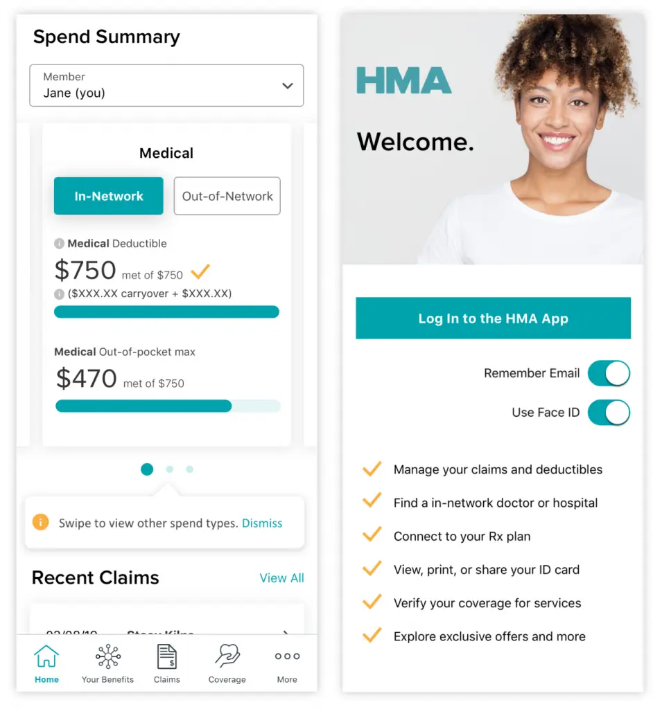
- Utilizing native OS capabilities like camera, FaceID, geolocation, and push notifications for both convenience and cost savings.
- Embedding secure design practices aligned with HIPAA, including short session timeouts and biometric login.
We also discussed future opportunities for AI-driven personalization, such as suggesting relevant actions (e.g., checking claim status, scheduling follow-ups) based on past behavior.
HMA’s mHealth App: Lean, Secure, and User-Centered
By the time we were done, HMA’s mHealth app boasted a lean, focused feature set that made smart use of native capabilities.
Key features include:
- Member ID cards front and center, with an interactive “flip” experience for front/back display; ideal for appointments.
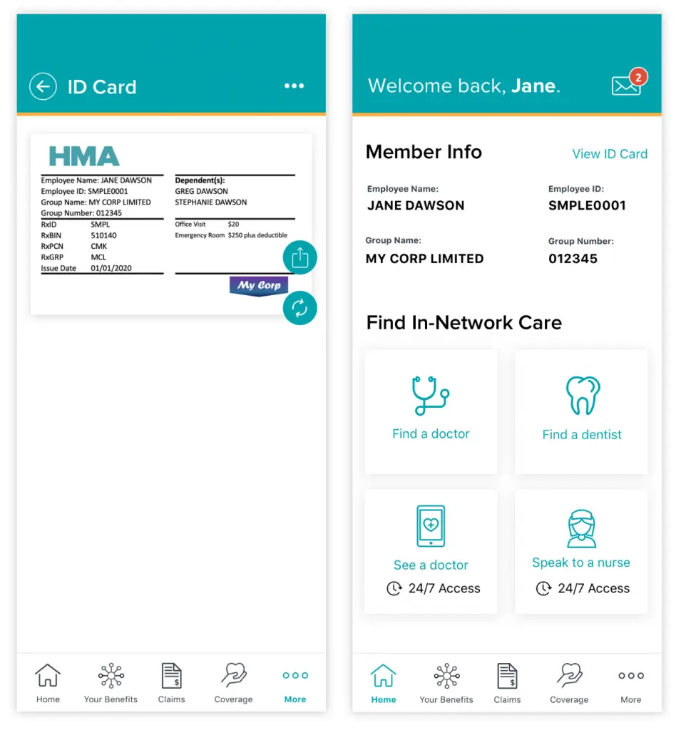
- Progressive data disclosure, showing just enough recent information with options to drill deeper.
- Native UI patterns like tabbed navigation and swipe gestures, designed for quick access.
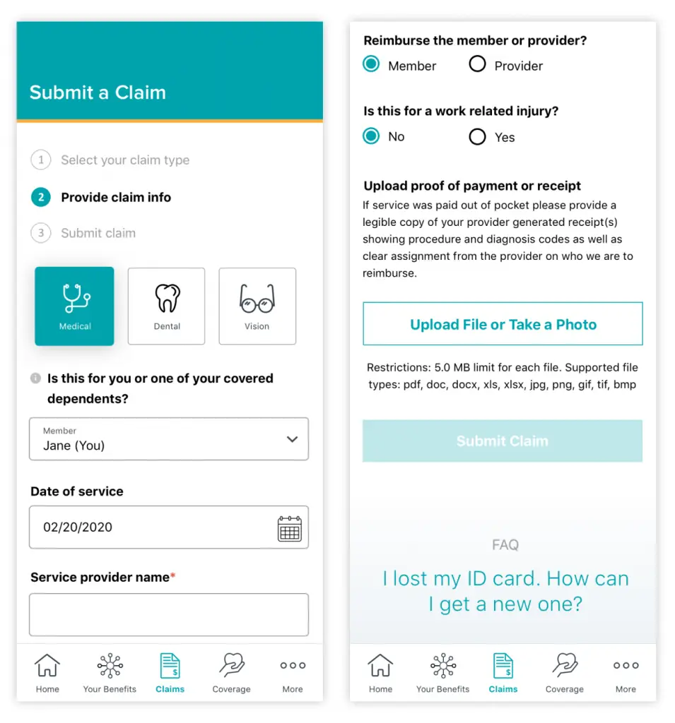
- Streamlined claim submission using the device’s camera.
- Biometric login via FaceID, plus auto-logout for added security.
- Push notifications for real-time customer support responses.
These enhancements provided a mobile experience that was not only simpler and more secure, but also more aligned with how people actually use their phones.
What’s Next? The Road to Continuous Improvement
A modern mHealth app is never truly “done.” As part of HMA’s roadmap, future enhancements may include:
- AI-powered chat and self-service tools for faster support.
- Predictive prompts that guide users based on past behavior.
- Analytics-driven optimization, using real-time data to refine UX continuously.
In 2025, healthcare apps must deliver more than access. They must anticipate needs, protect sensitive data, and meet user expectations for speed and simplicity.
Ready to upgrade your healthcare organization’s mobile experience? Let’s build something that delivers what today’s users really need; safely, smartly, and seamlessly.