When NASA engineers began preparing for the Artemis missions, a program designed to return humans to the Moon and eventually journey to Mars, the process didn’t start with full-scale rockets. Instead, they used scaled models to simulate launches, test aerodynamics, and evaluate potential design flaws.
This iterative, small-scale testing allowed NASA to refine critical details before committing massive time and resources to full production. In the world of UX design, we follow a similar principle: prototyping. Prototypes allow teams to simulate, test, and improve digital products early in the design process, before heavy investments are made in development.
At UpTop, we leverage prototypes not just to visualize ideas, but to explore, explain, and validate interactions that will shape a product’s success.

Why Prototype?
There are three core reasons to use prototypes in the UX design process:
1. Explore
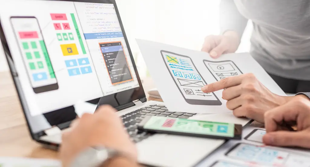
Prototypes unleash creative exploration that static wireframes cannot match. They allow designers to test ideas dynamically; experimenting with motion, transitions, and micro-interactions that bring a product to life.
In a world where meaningful micro-moments can set apps apart, prototypes enable rapid iteration and discovery, leading to more memorable, usable, and delightful experiences.
2. Explain
Prototypes serve as powerful communication tools. Instead of lengthy annotations describing how an interaction should behave, stakeholders and developers can experience the interaction firsthand.
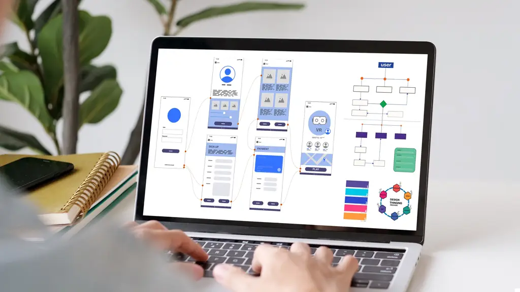
A click-through prototype clarifies details like navigation transitions, animations, and dynamic content changes; reducing misinterpretations and improving cross-functional collaboration.
3. Validate
The most critical reason to prototype is to validate assumptions early. Much like NASA tests vehicle designs before launch, we test product designs with real users before development begins.
By putting functional prototypes into usability studies, we surface:
- User friction points
- Misaligned expectations
- Unmet needs
These insights empower teams to pivot, refine, or rethink designs without incurring the costly consequences of coding the wrong solution.
How to Prototype
The world of prototyping tools has evolved significantly in recent years. Today’s tools offer a balance between speed, depth, and collaboration; making prototyping more accessible and powerful than ever.
When selecting a prototyping approach, designers must consider two key spectrums:
- Page Flows vs. Micro-Interactions: Some tools excel at mapping high-level user journeys, others specialize in detailed interaction animation.
- Depth vs. Speed: Deeper prototypes simulate complex behaviors, but rapid prototyping tools enable faster exploration and iteration.
Popular Prototyping Tools Today:
- Figma: Best-in-class for real-time collaboration, page flows, and quick clickthrough experiences. Supports basic-to-moderate micro-interactions, with continued expansion into complex prototyping.
- Framer: Ideal for polished, detailed micro-interactions and high-fidelity animation.
Suitable for marketing sites, apps, and moments where motion is critical to the experience. - UXPin and ProtoPie: Useful for simulating complex logic, conditional flows, and near-development fidelity prototypes.
Choosing the right tool depends on the goals of the prototype; whether it’s to validate user journeys, fine-tune transitions, or both.

When To Prototype
Early and often should be the mantra. Prototyping should not be reserved for the final stages of design, it should be embedded into the early exploration phase to test and learn quickly.
With tools like Figma enabling seamless movement from wireframe to interactive prototype, creating clickthrough experiences for usability testing or internal feedback is easier than ever.
At UpTop, we prioritize prototyping as early as possible to:
- Validate assumptions about key flows (“golden paths”)
- Collect user feedback before development investment
- Iterate rapidly based on real-world interactions
The earlier we prototype, the sooner we can identify issues, improve experiences, and increase confidence heading into production.
Prototyping: The Digital Wind Tunnel
Creating digital products without early prototyping is like launching a rocket without wind tunnel testing. By putting designs through the “digital wind tunnel” of real users and iterative testing, teams can learn, adjust, and optimize before it’s too late.
Prototyping isn’t just a design task — it’s a risk mitigation strategy, a collaboration accelerator, and a creativity catalyst. It empowers organizations to build smarter, faster, and with greater confidence.
At UpTop, our UX experts, designers, strategists, and developers help companies harness the power of prototyping to reduce risk, maximize user satisfaction, and accelerate success. Let’s talk about how we can help you design with certainty and launch with confidence.


