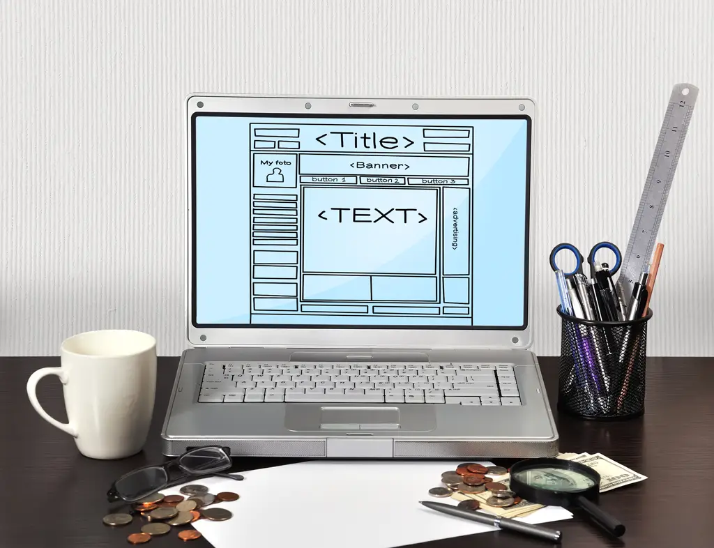
An optimized website navigation menu is crucial for creating an exceptional user experience (UX). As the gateway to your website’s content and offerings, menus are pivotal in guiding visitors toward their desired goals. This article discusses five essential steps to optimize website navigation, ensuring your customers can seamlessly explore your digital presence and engage with your brand. By prioritizing UX in your design, you can improve key performance metrics and foster lasting customer loyalty.

Website Navigation as Part of the User Experience
Crafting effective value drivers for a business involves more than just showcasing your products or encouraging customers to take specific actions (like clicking the big, friendly-looking “Buy Now” button). A great UX design approach is crucial to help users achieve their goals and website navigation is a critical aspect of UX design.
If your website is confusing or your brand appears unsympathetic, you risk losing potential customers. Users have specific, often subconscious, expectations regarding website navigation. The following best practices can help you address these and improve user interactions with your brand.
1. Limit Choices and Navigation Menu Selections
Too much freedom is not always a good thing. The more choices you force users to make, the greater the degree of decision fatigue that can eventually set in. For this reason, having more than seven or eight menu selections is a bad idea.
In sensitive situations requiring high levels of trust, users are willing to invest more time evaluating their options independently. However, guiding them to that point is usually necessary first.
2. Use Clickable Links and Limit Drop-Down Menus
Drop-down menus feel appropriate on desktop devices with large screens. On mobile devices, however, they quickly crowd the visual field and often get in the way of other website elements. A single mistaken tap can lead users to give up, close their browsers, and get on with their day.
The key here is balance. Website visitors appreciate the ability to navigate easily between different parts of the site. They may not always need to access pages through a drop-down menu.
3. Design for Web Accessibility
Very few commercial websites meet the stringent accessibility guidelines stipulated by the Americans with Disabilities Act. While the ADA encourages websites to offer accessible navigation menu alternatives to users, there are no hard-and-fast regulations.
There is a near-limitless set of potential disabilities that might make accessible navigation options necessary. While you can’t predict and serve every potential accessibility need, there are certain things you can do. For instance, you can implement visual and audio alternatives and ensure you have alt text available for every clickable image. Every small step counts.
4. Don’t Hide Your Website’s Search Bar
The search bar is the most commonly used element on the homepage for most websites. Users are accustomed to using search bars and are more likely to use yours than remember the specific menu structure that previously led them to a page. The optimal placement for your search box is at the top of the homepage sidebar or in the header area. This has become the standard expectation for most web users. There are few other uses for that prime real estate that would be more beneficial to users than a highly visible and functional search bar.
5. Never Force Users to Use the Browser’s “Back” Button
Sometimes users browse an eCommerce site and then wish to return to the home page. Can a user easily do that without using their browser’s back button? If not, you should always have a navigation guide available for each page, showing users where they are and how they can get home with a single click.
If you let users use the browser’s back button, they may accidentally leave your website entirely. Not all of them will expend the effort to come back, especially mobile users.
Keep UX at the Core of Your Design Decisions
Websites, user experiences, brands, and products constantly evolve to meet changing expectations, cultural attitudes, and social norms. Design principles that work today may not be effective tomorrow. As a fluid discipline, design requires an ongoing commitment to improving the craft and simplifying user interactions to ensure success. If you need help optimizing your digital experiences, consider partnering with a UX design agency like UpTop. Our experts can create intuitive, engaging applications and websites that drive real business results. Let’s chat.


