Mattress Firm

Optimizing UX and eCommerce Functionality

The Largest Mattress Retailer in the U.S.

Mattress Firm, the largest mattress retailer in the U.S., was established in 1986 with the goal of becoming a different kind of mattress retailer. Through a strong focus on creating a unique shopping experience with a large selection of quality brand name bedding products, competitive pricing, and knowledgeable associates, Mattress Firm has emerged as the gold standard of its industry.

Mattress Firm first engaged UpTop with the goal of assessing their recently created website, and addressing any trouble spots or shortcomings that may be hindering conversions and overall user appeal. Throughout the 7 year relationship, UpTop worked to improve Mattress Firm’s e-commerce experiences, from home page to checkout using analytics, user feedback, and industry best practices. A few specific examples include an expansive Post Purchase UX audit and update of the entire checkout flow.

Project Info

client
Mattress Firm
services
Website Design Strategy, UX Design, Visual Design, Analytics, Front-end Development
type
Mobile and Desktop Experience
“One of the things that makes UpTop special is that we can go to them with any problem or task we have, and they’re always willing to figure out a way to solve it or get it done. They’ve delivered on every project beyond expectations.”
—  Director of Digital Development, Mattress Firm
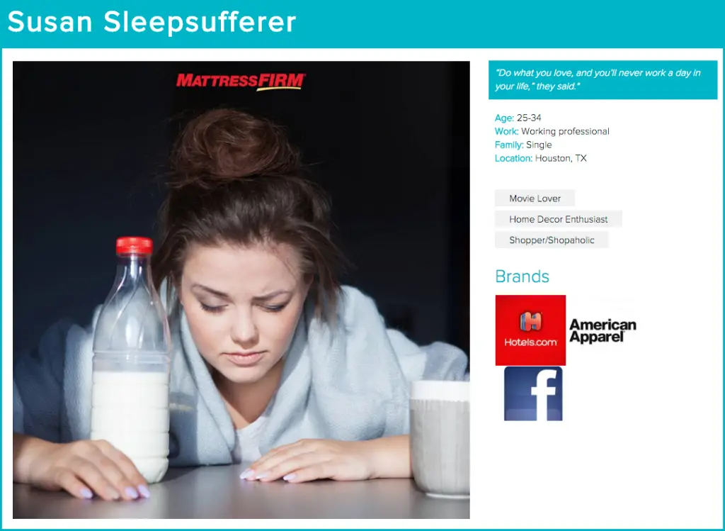
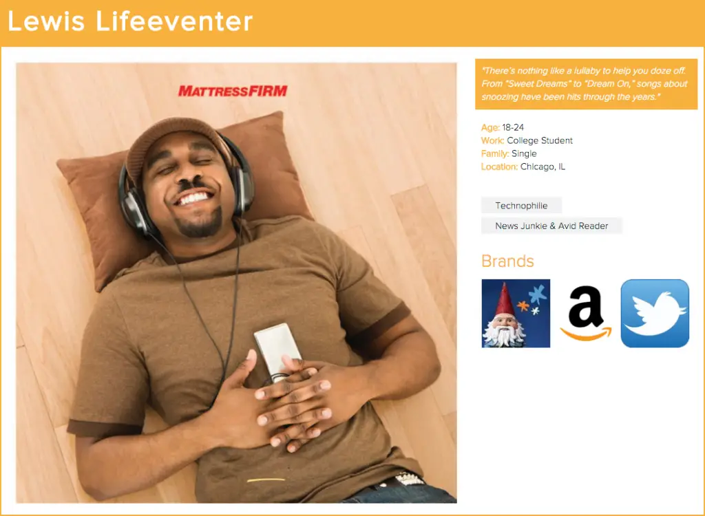
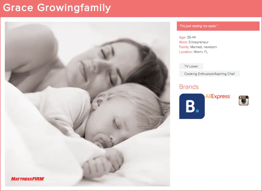
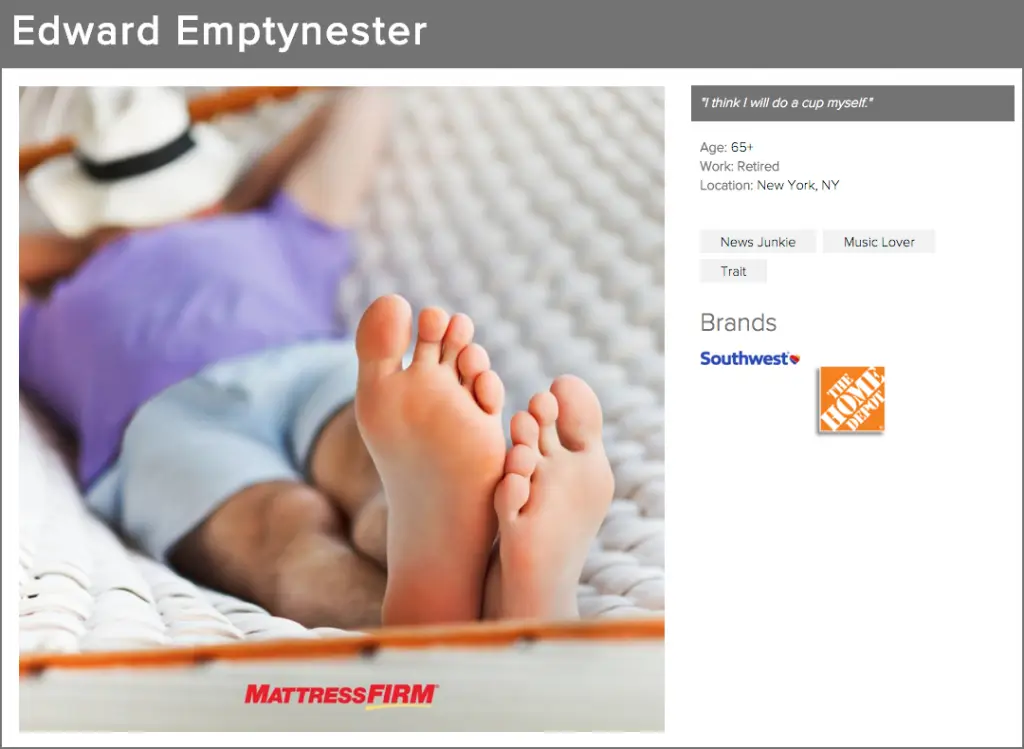
Personas

Trouble Spots & Omissions

When Mattress Firm engaged UpTop, they were searching for a partner to help them design attractive and appealing pages on their newly-launched enterprise web platform, which we were able to accomplish through intuitive user experience design and acute attention to detail. Additionally, as part of the initial assessment (based on user research and best practices), UpTop surfaced several trouble spots with the website’s shopping cart flow as well as usability issues due to the absence of category landing pages.

Site Optimization & Redesign

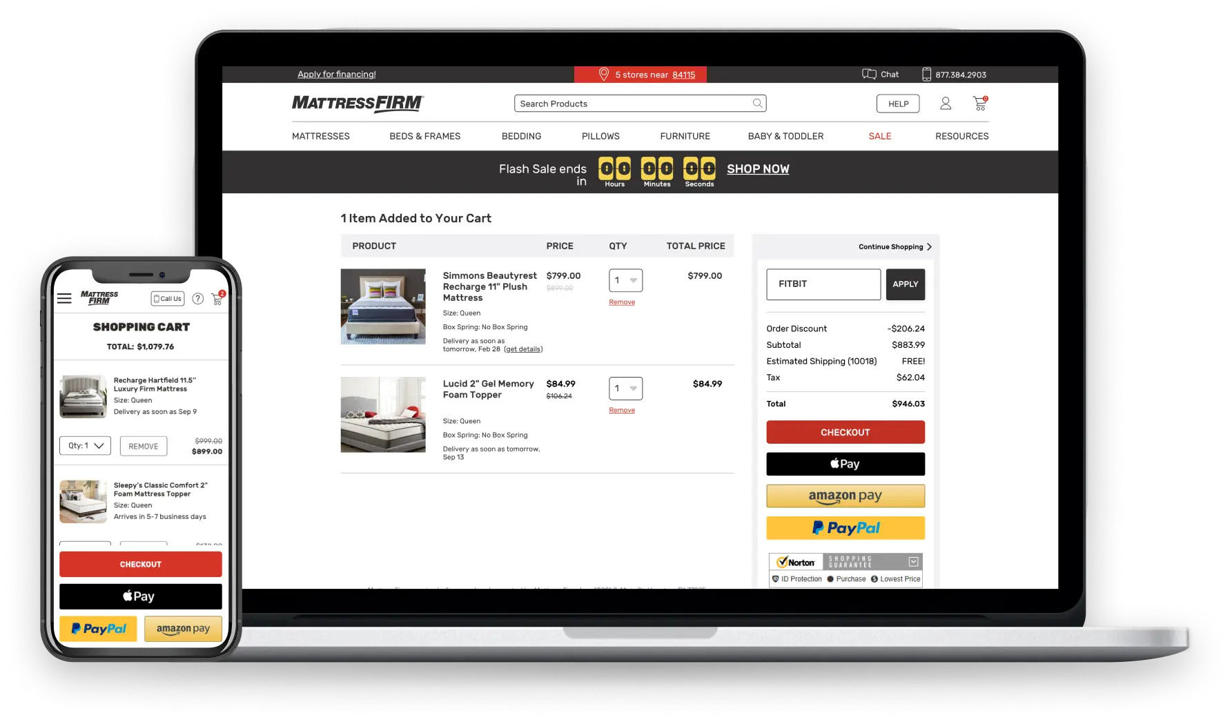
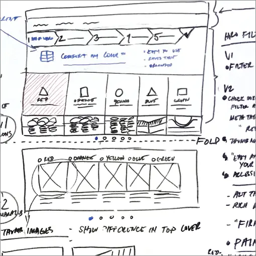
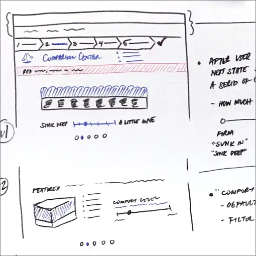
While site migration was taking place, UpTop gradually began the work that had surfaced in the digital strategy phase of the project. This included the redesign of the site’s header, footer, main navigation bar, and homepage. It also included the creation of true category landing pages to support user browsing, and aid in product discoverability, which were missing from the initial design. Eventually, these smaller projects turned into a complete redesign of the shopping cart experience that addressed shoppers’ security concerns and simplified the overall checkout process. Through all of our redesign work, we created a more frictionless and cohesive experience.

Technologies

HTML5, Analytics, CSS, JavaScript

The Results: Overall Conversion Rate Nearly Doubled

As a result, our collaboration and on-going partnership yielded 43% in overall conversion rate, and 60% improvement in shopping cart conversion rate alone.
43%
increase in overall conversion rate
60%
increase in shopping cart conversion rate

Post Purchase UX Audit

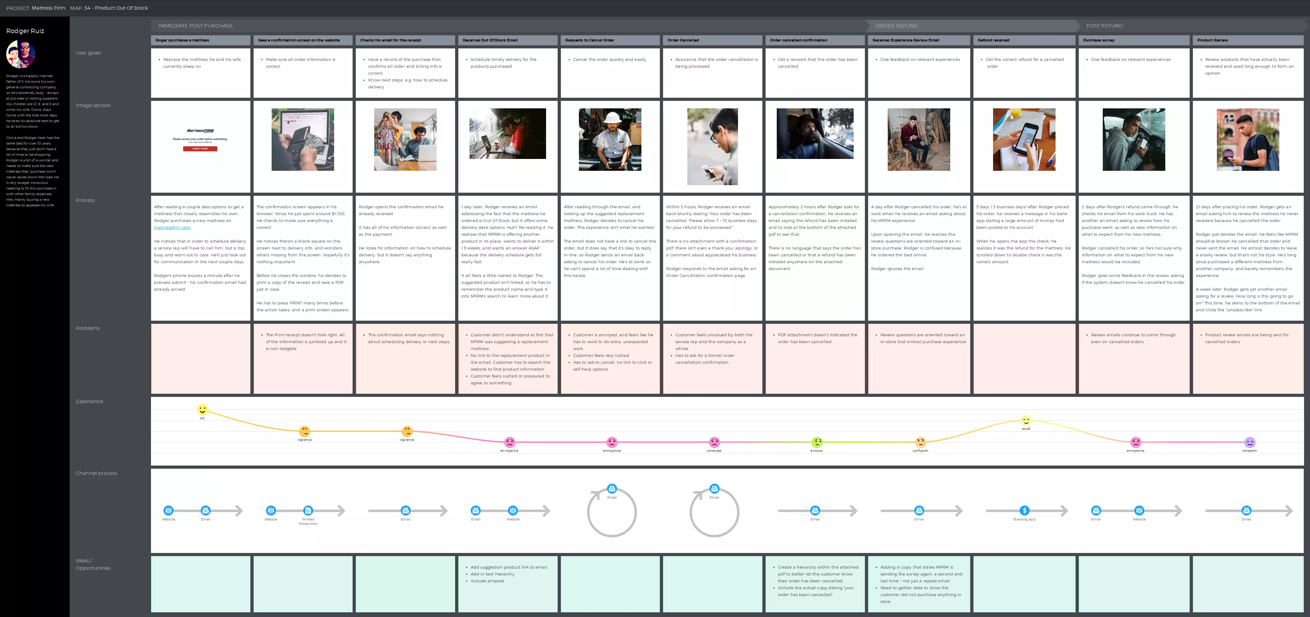
In the years after the initial work was done, Mattress Firm and UpTop kept a very close relationship. The UpTop UX team was asked to perform an audit of Mattress Firm’s post-purchase experience: everything that the user (customer) would experience after they clicked the “complete purchase” button in checkout for six different scenarios. Our research process used investigative methods including persona building, journey mapping, competitive analysis, feedback and sentiment review, usability testing, and mystery shopping.

UpTop delivered an extremely comprehensive audit that revealed the top priorities of these customers and made pointed suggestions on how to update, redesign, think about differently, and improve those priorities.

Full Checkout Redesign

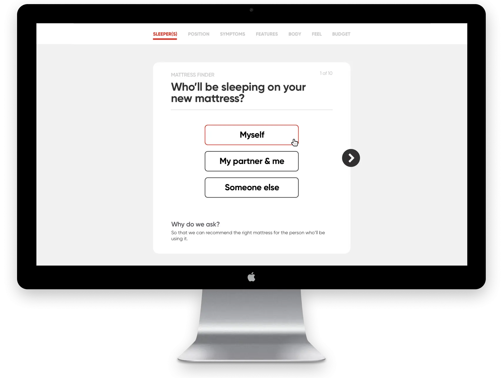
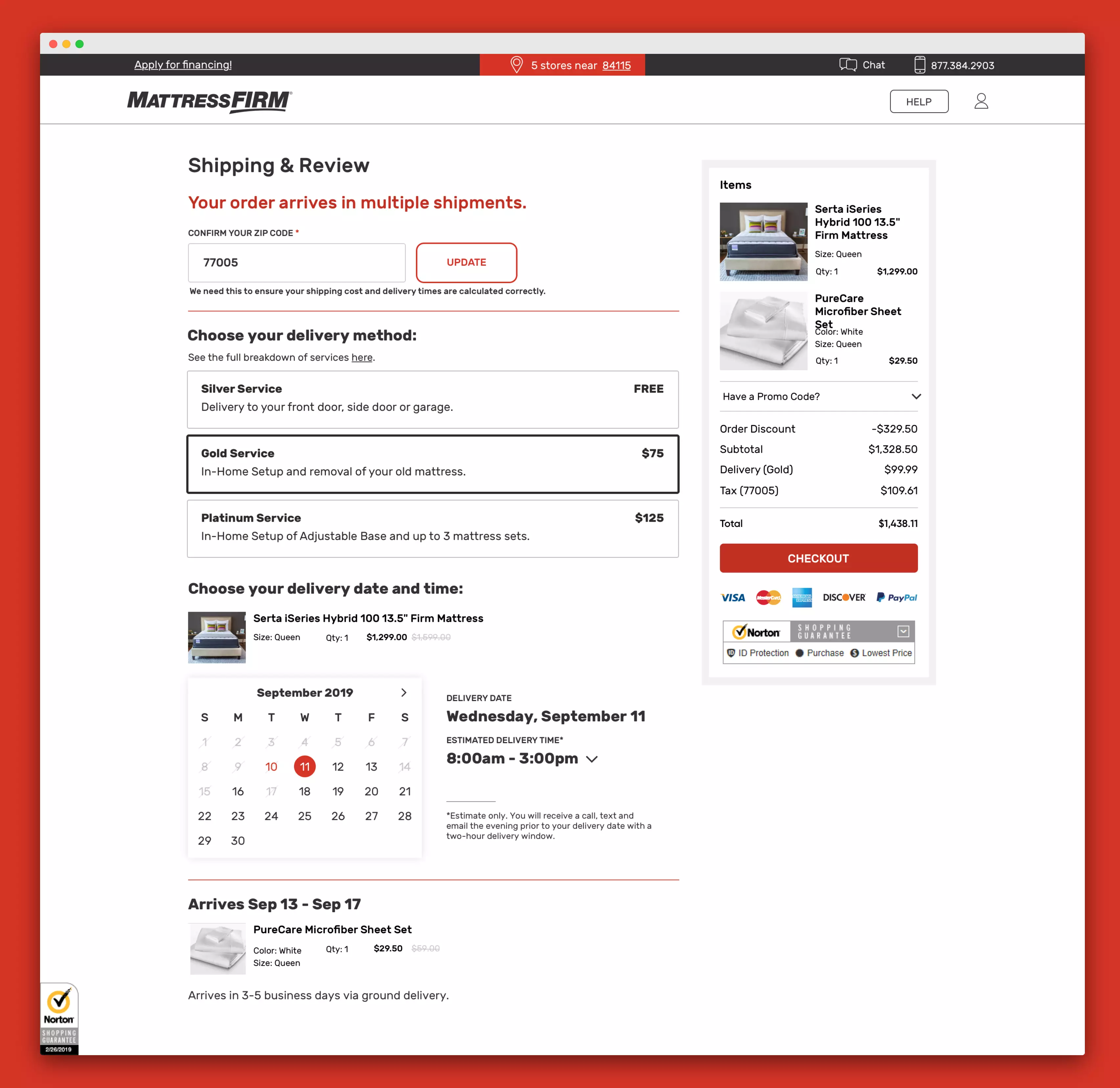
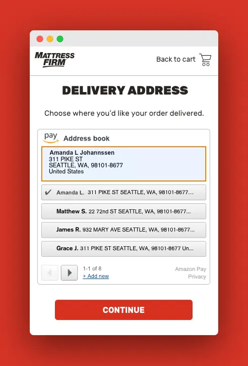
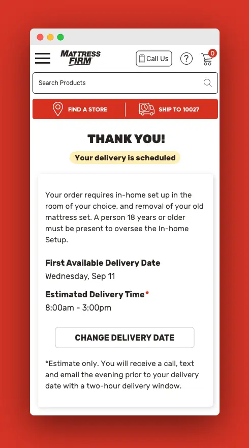
With numbers not quite hitting the mark, UpTop took on revamping the entire checkout flow for the user. The goal was to make an information and choice dense process easier to understand and faster to get to purchase. As one-click checkout was entering the digital world, UpTop also suggested Mattress Firm add this to their checkout flow. With the flow updates, UX language adjustments, one-click purchasing addition, and visual changes Mattress Firm saw less cart abandonment, and a higher conversion rate. 
Let's make awesome things, together.

Whether you are looking to create a new product or update an old design, we are here to assist you.